Caitlin O'Hara | Graphic Design
Hi! I'm a Graphic Designer, with over a decade of experience in design and built spaces. I specialize in Experiential Graphic Design with a strong understanding of two-dimensional and three-dimensional design, brand development, and custom graphics. I have collaborated with amazing teams and worked with stellar clients throughout my career. Please enjoy some samplings of my work.
Toast Boston
Establishing placemaking through branding and colors.
Amherst College Alumni Gymnasium
Celebrating varsity sports and communal athletics
Dumke Arts Plaza
A community gathering space for art, gathering and community
Bonnet Spring Park
Public park that celebrates its history and opens its arms to its community.
Wilmington Waterfront Promenade
Transforming an old port into a community gateway.
SharkNinja HQ Expansion
Reimagining an existing headquarters with a fresh look and feel.
Toast Boston
Looking to rebrand their existing interior space, me and the Sasaki team were tasked with invigorating a very monochrome working space with bold and bright placemaking elements. Toast has a vibrant existing brand and promotes its employees to make the space feel like theirs. We designed a color coded wayfinding system that was flexible and customizable to match the needs of the client. We celebrated moments that make the company and its users special, through Values walls, Customer Experience walls, Hardware Museums, and Sales Metrics Walls.Client: Toast
Designers: Sasaki
Project Completed: 2021
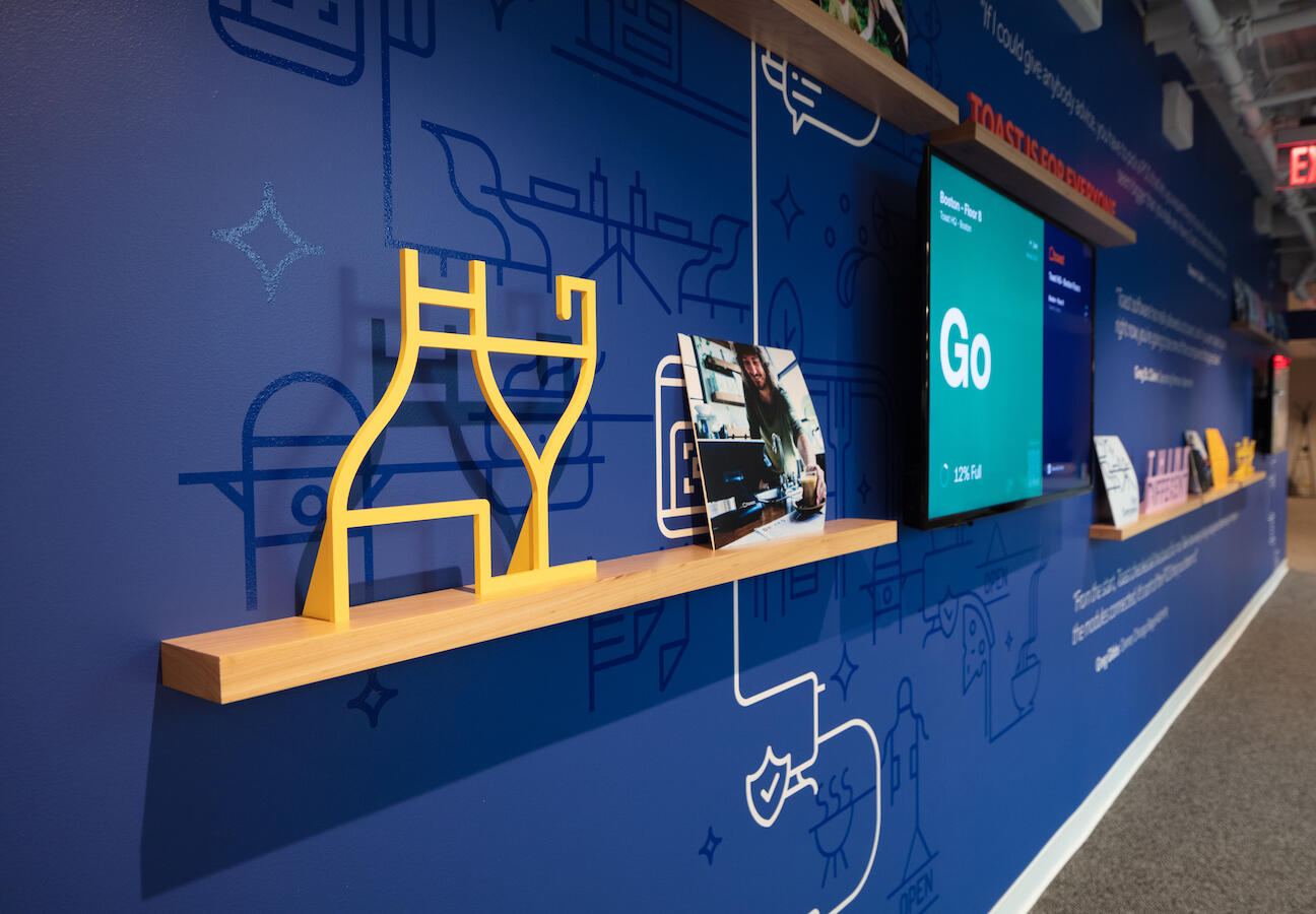
The Customer Experience wall was designed to highlight Toast's happy customers. Shelving and digital displays allow for content flexibility. Quotes and icons adorn the wall graphics.
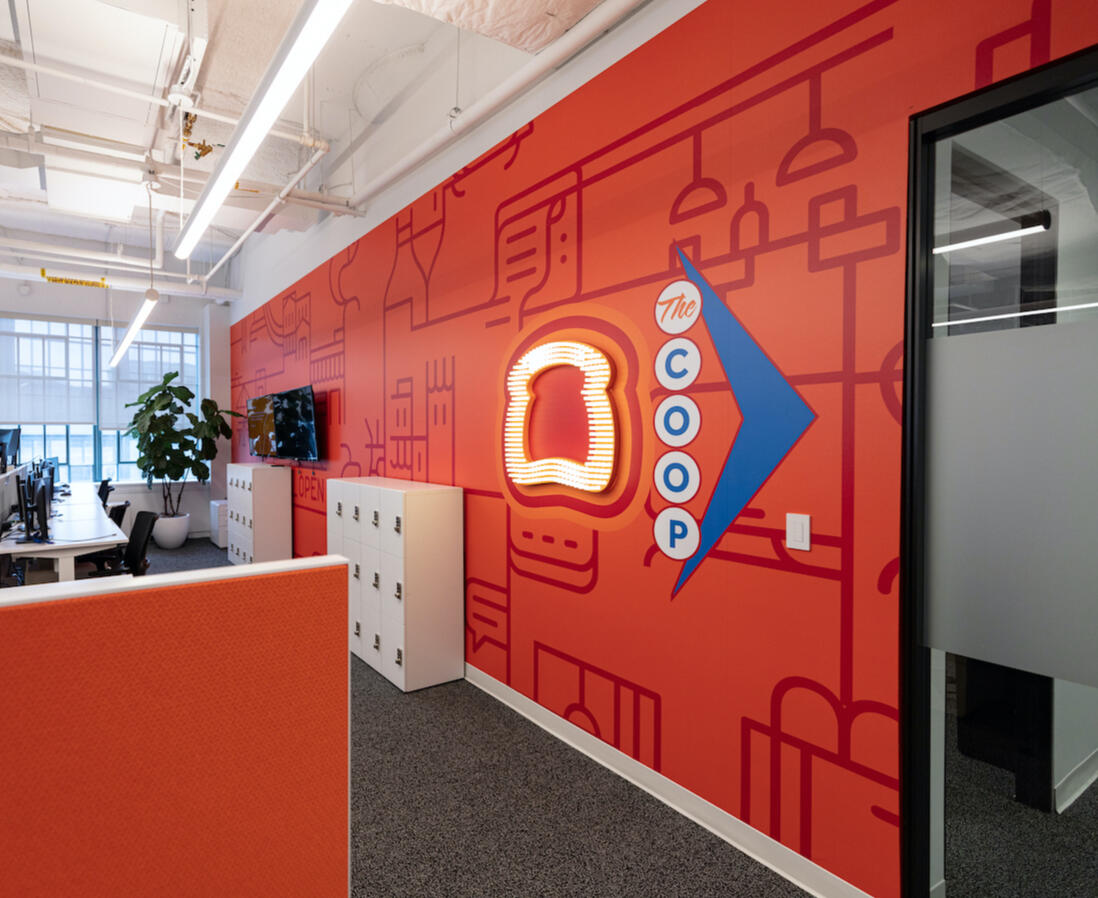
Feature wall leading to the cafe, called 'The Coop', with dimensional illuminated signage lite-brite logo and 2D wall graphic, composed of inter-connected icons.
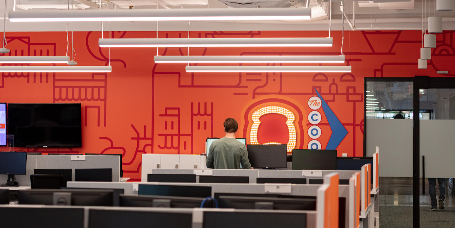
TextFeature 'Coop' Wall from a distance.
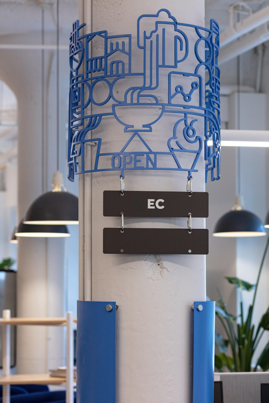
Custom 3D column wraps that are made of interconnected brand icons. Below the icons, hangs departments names, attached to hooks allowing reposition in the office. Custom magnet boards sit below.
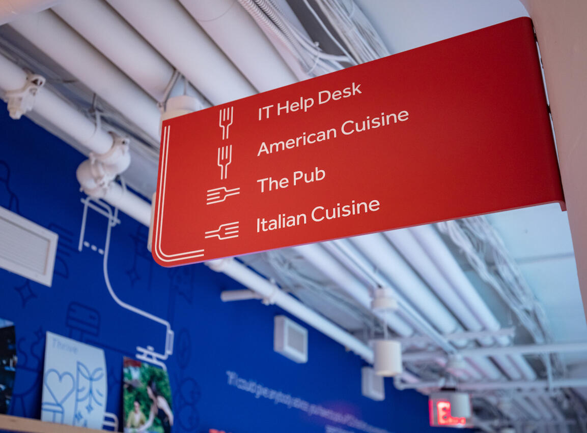
Overhead blade signage system for wayfinding.
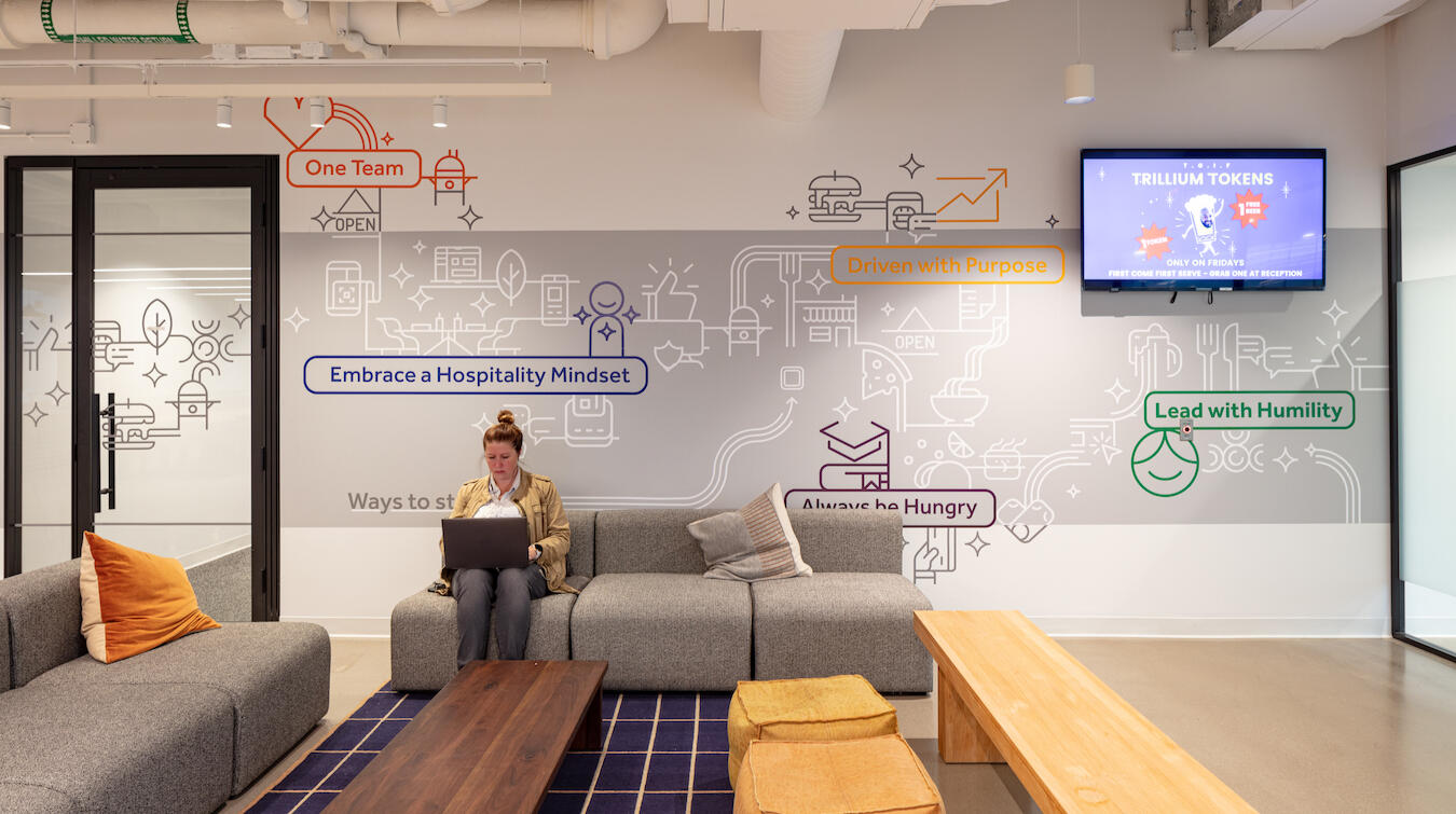
Values wall in 'The Coop'. This wall celebrates the values put forth and promoted by Toast. Each value is highlighted in a bold branded color and interconnected with the icon system. A digital display is on the wall to highlight employees who exemplify the company's values.
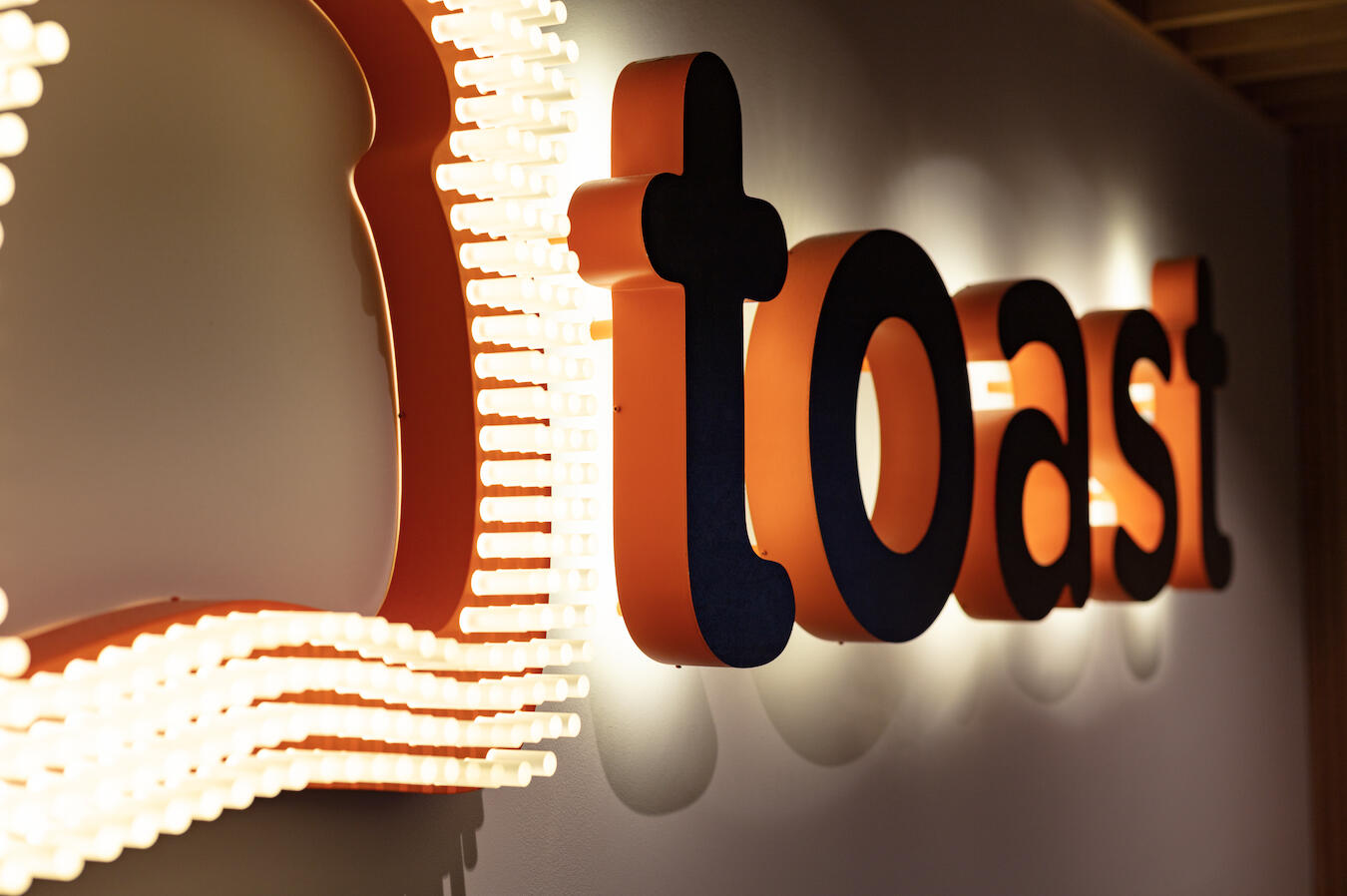
Illuminated logo made to look like a lite-brite. Halo lit logo letters with orange painted sides.
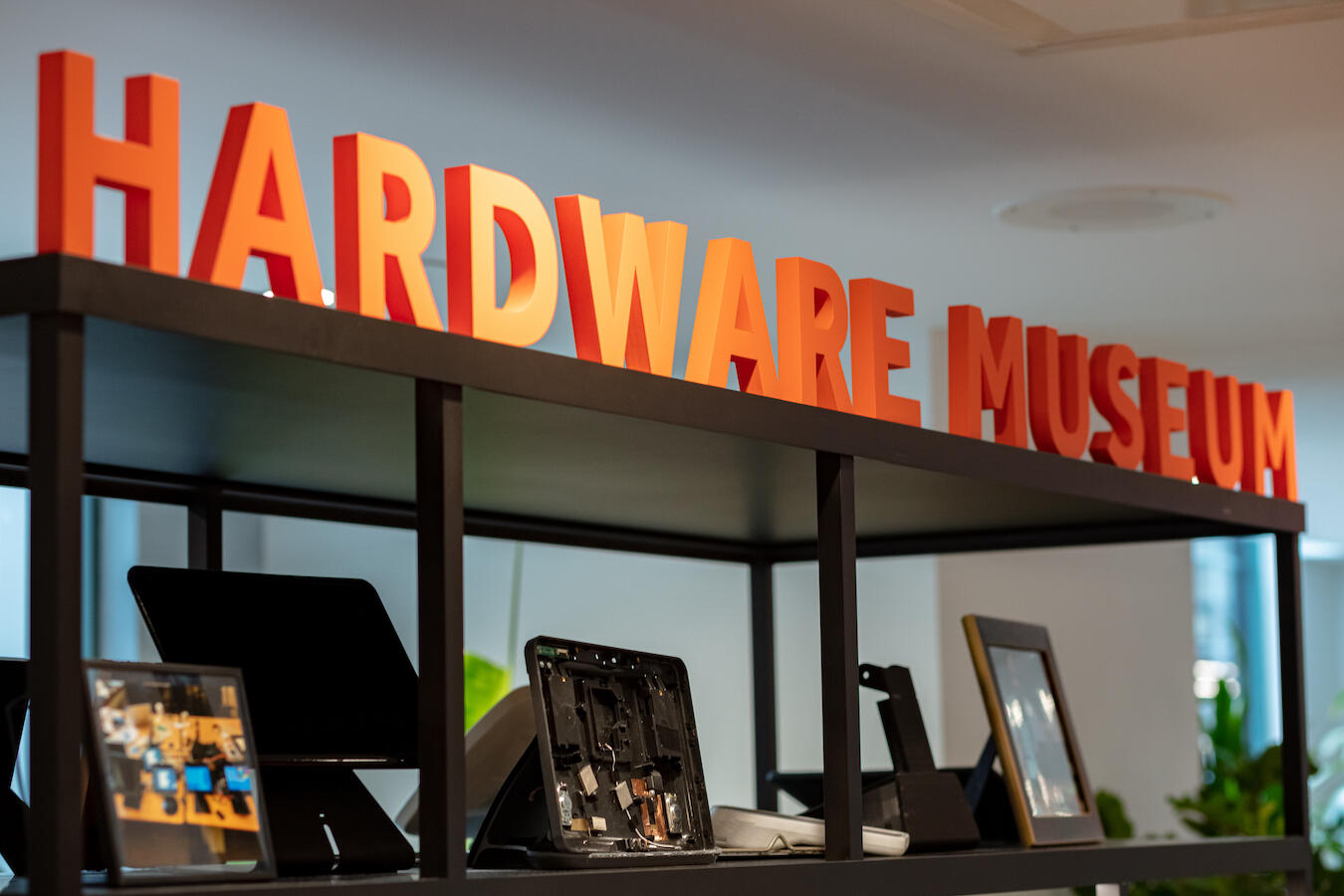
Custom fabricated kiosk to highlight the development of their technology advancement from conception.
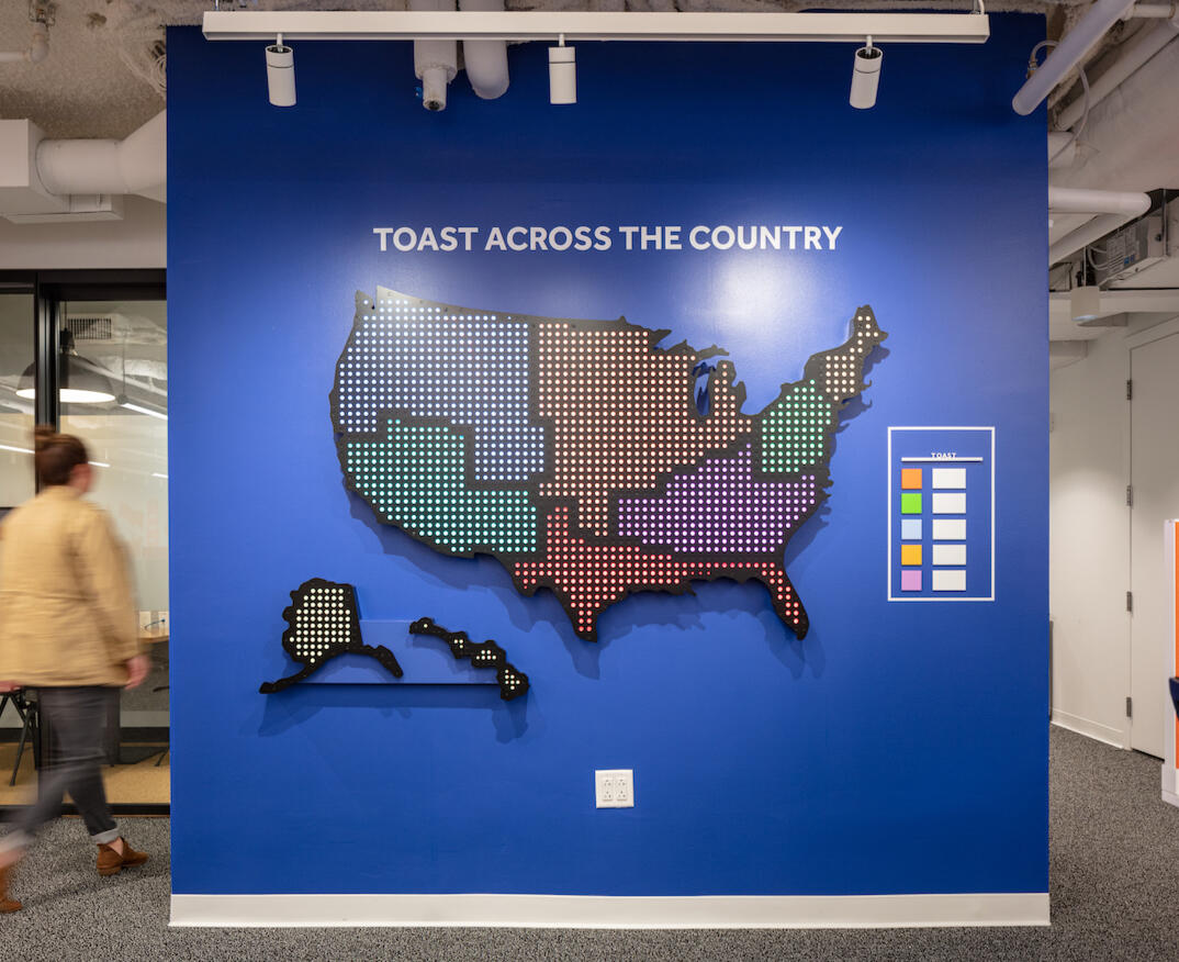
Illuminated map of the U.S. Designed with changeable light colors to be able to represent metric values of regional sales. Each color represented a sales value range.
Amherst College Alumni Gymnasium
Amherst College Athletics was looking to refresh their existing gymnasium, fitness and recreational facility to feel more welcoming and inviting for students and faculty. The building is federalist style and had thick, heavy detailing through the space that did not promote the most inviting experience. The hallways were lined with dark wood trim and frames filled with team images throughout the school's history. While the historic images were an interesting feature, they did not represent the vision and future of the school and community.We reimagined the space with lighter, brighter colors that were school branded and bold. The lobby was repositioned with a custom desk and glass doors. The graphic design concepts have two themes, 'athletics' and 'school community'. The athletics graphics and bolder, more traditional sports branding, that lean heavily into the primary branded purple. All varsity sports are represented and celebrated. The school community graphics pull more from the secondary branded palette and have campus life imagery, to ensure that all students fee represented in the space.Client: Amherst College
Designers: Sasaki
Project Completed: 2023
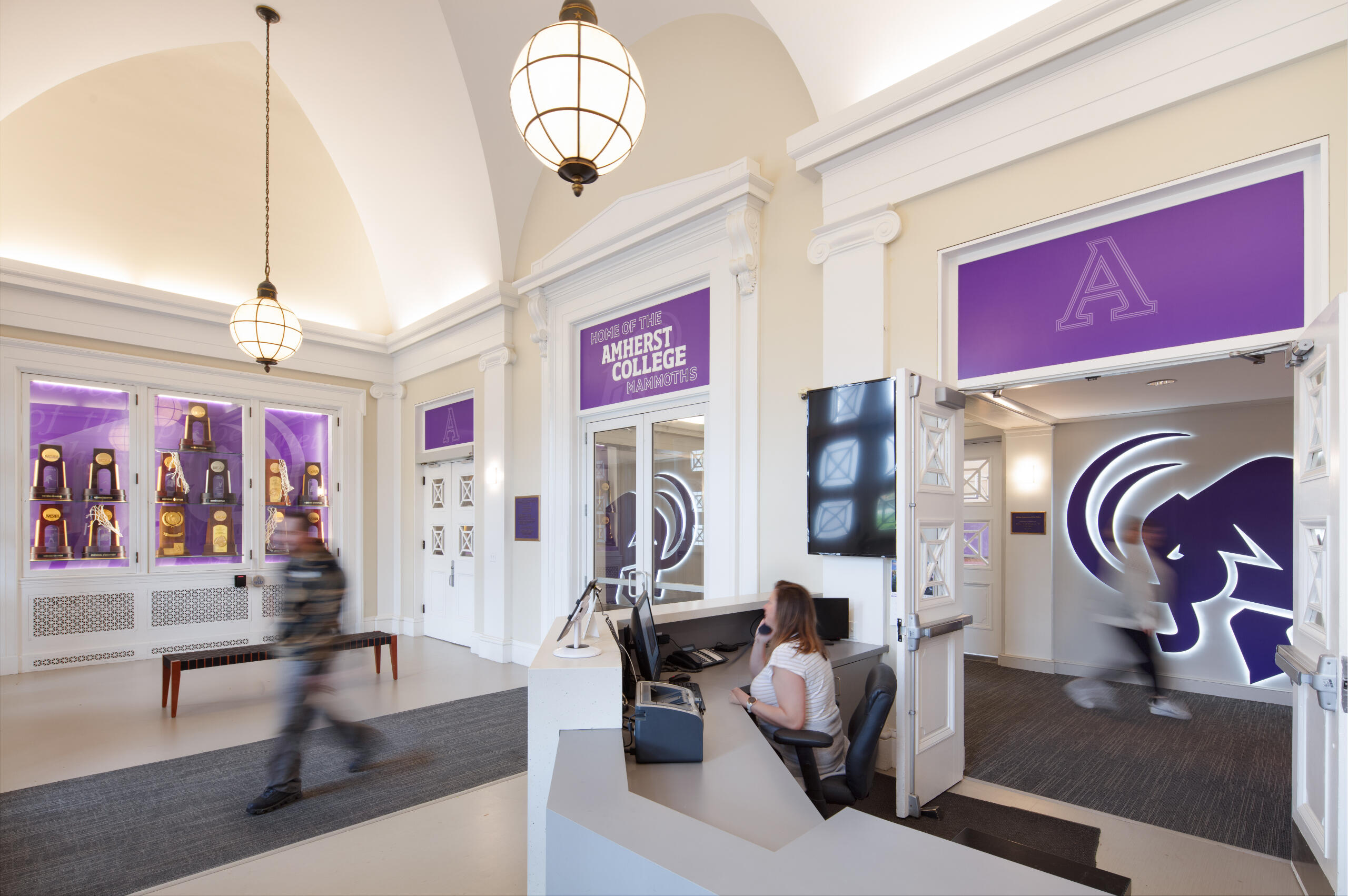
The entry lobby with repositioned custom desk is light and bright. The white paint makes the branded purple banners pop. You can see the illuminated mammoths beyond the lobby through the new glass doors.
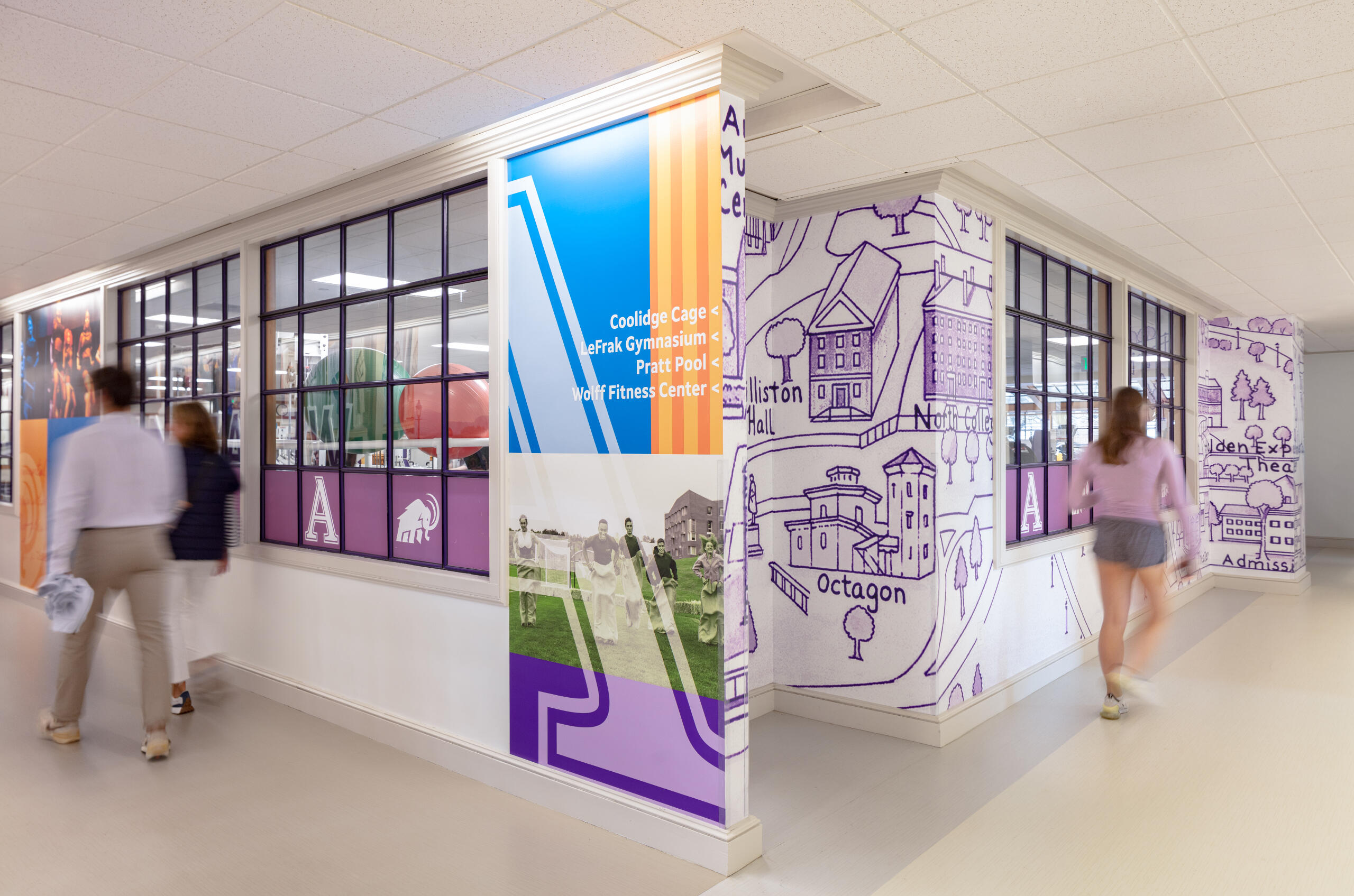
Community graphics feature student life and a illustrated campus map. Wayfinding was integrated into the wall graphic design.
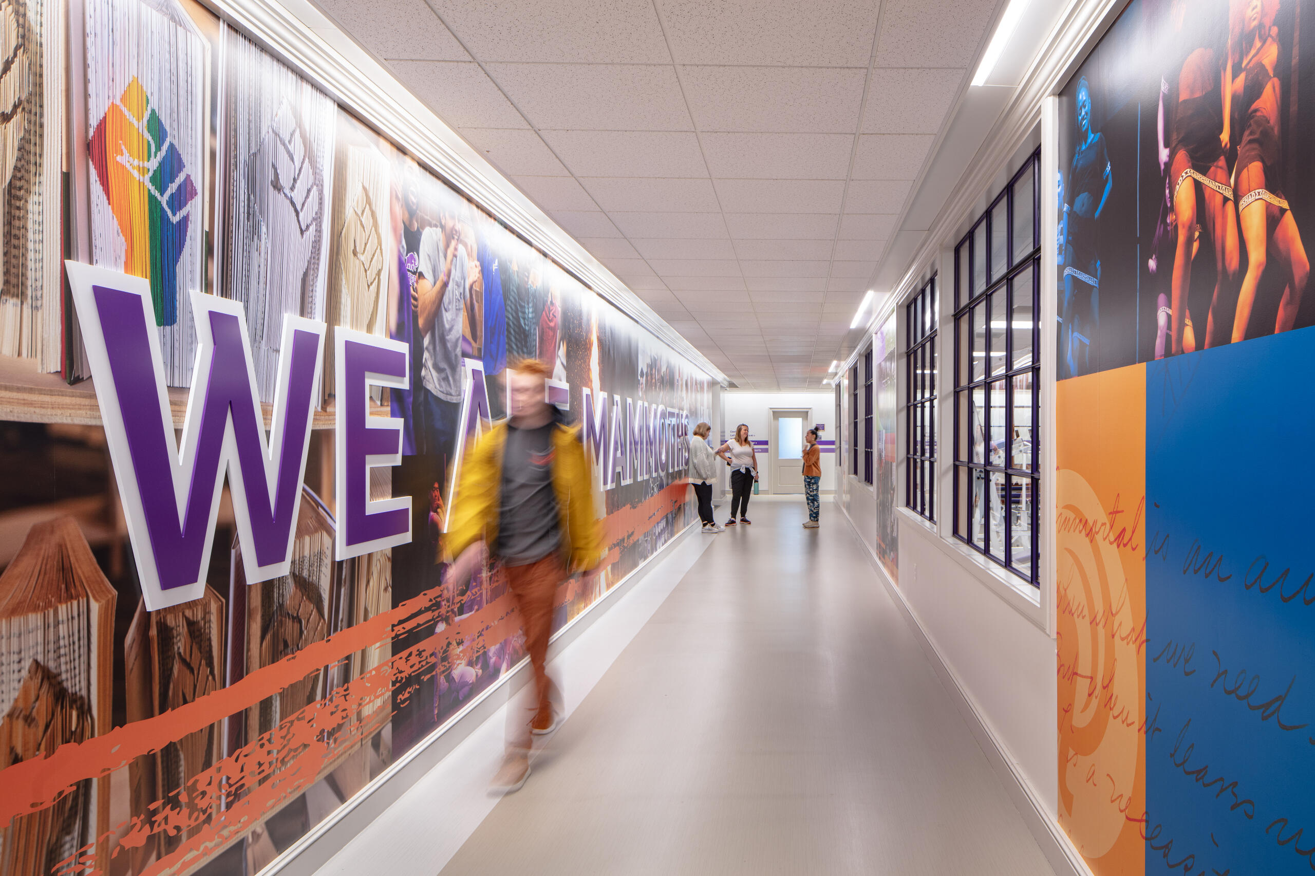
The community graphics continue down the hall, with bold imagery and dimensional letters, 'We Are Mammoths' spanning the length of the wall. Secondary branding colors give a bold pop next to the primary purple seen in the athletic graphics.
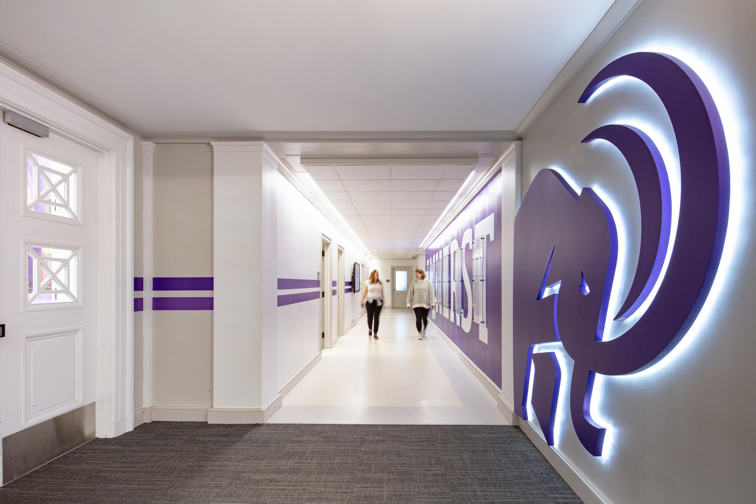
Two illuminated mammoths great you at the entry into the hallway to bring school pride.
The hallways flanking the varsity coach's offices pack a punch of purple. The walls have plaques of accolades that can be changed and added to as new champions arise.
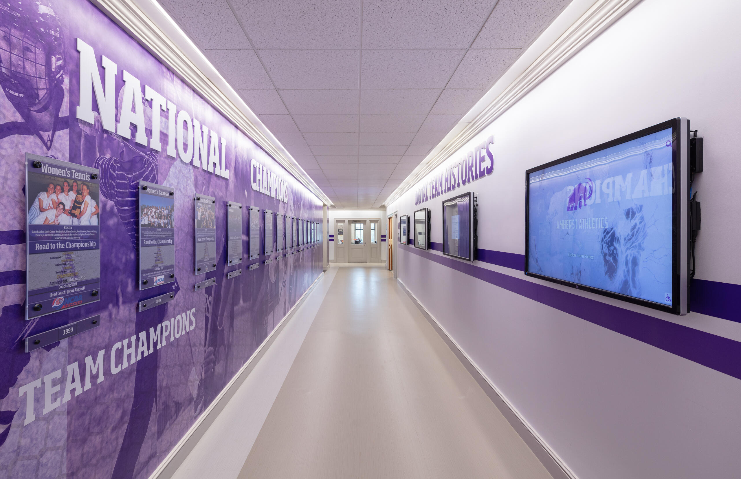
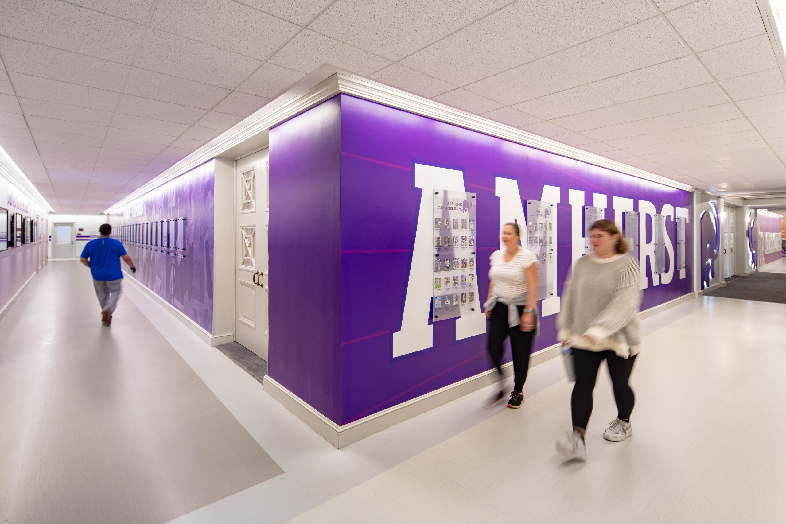
A custom collage that displays all the varsity sports at Amherst is layered with plaques honoring National Champions. The opposing wall has four digital touch screens, programmed to house the team photos that once lined these walls.
Dumke Arts Plaza
Located in Ogden Utah, this community based project was looking to develop a site for art and social gathering. We were tasked with helping to develop a brand for external facing collateral, as well as brand identity on site. Sasaki developed a large beacon sculpture that defines the space. That was a large inspiration point for the branding and identity. Working closely with the architecture team, we utilized the landscape, sculpture and signage to all flow into one element. The signage typography is playful and clean. The colors and lights on the signage provide a vibrant and recognizable entry sequence.Client: City of Ogden
Designers: Sasaki
Project Completed: 2022
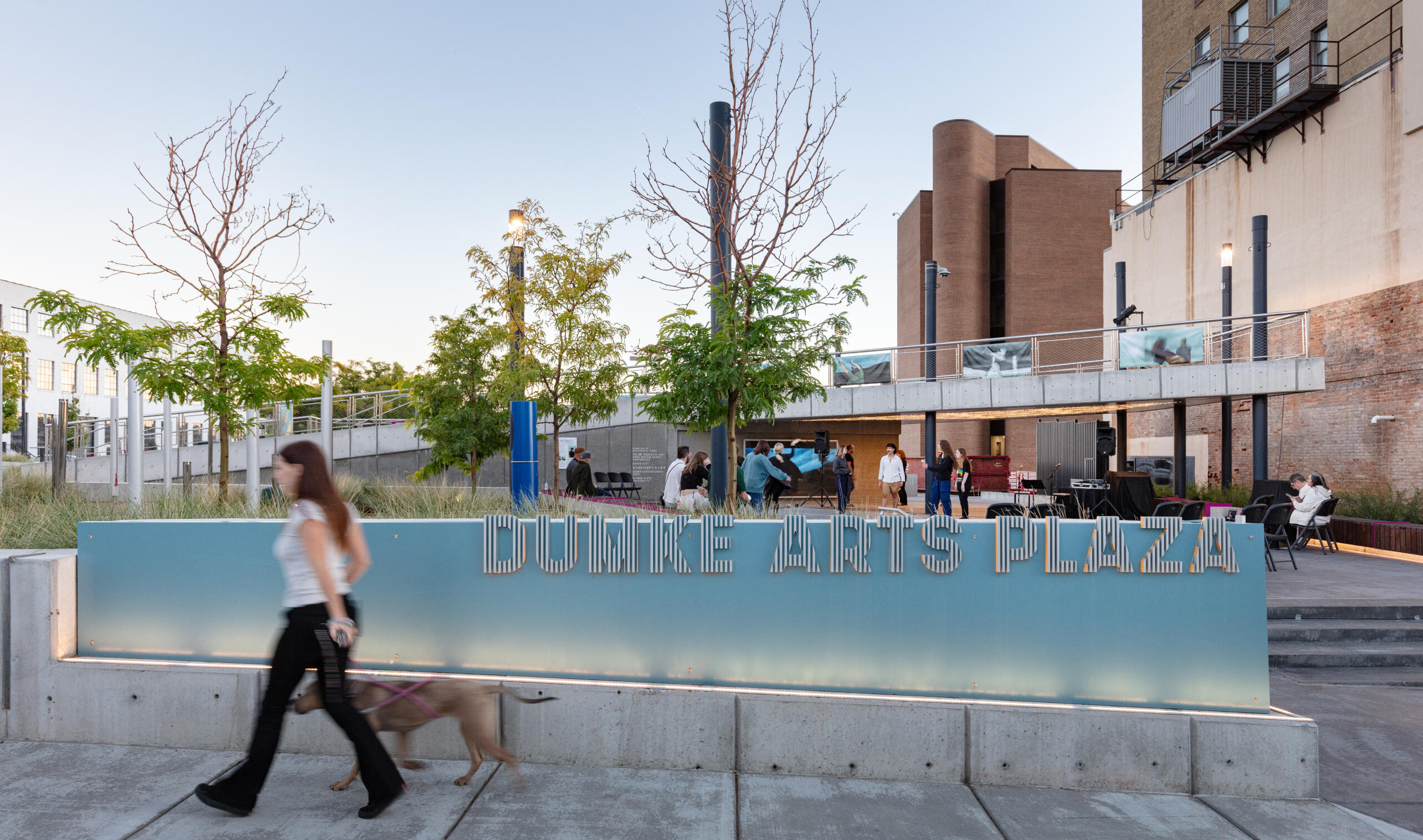
The custom fabricated signage features vertical lettered slats to mimic the landscape posts. The letter edges are painted to give the signage a pop in its identity.
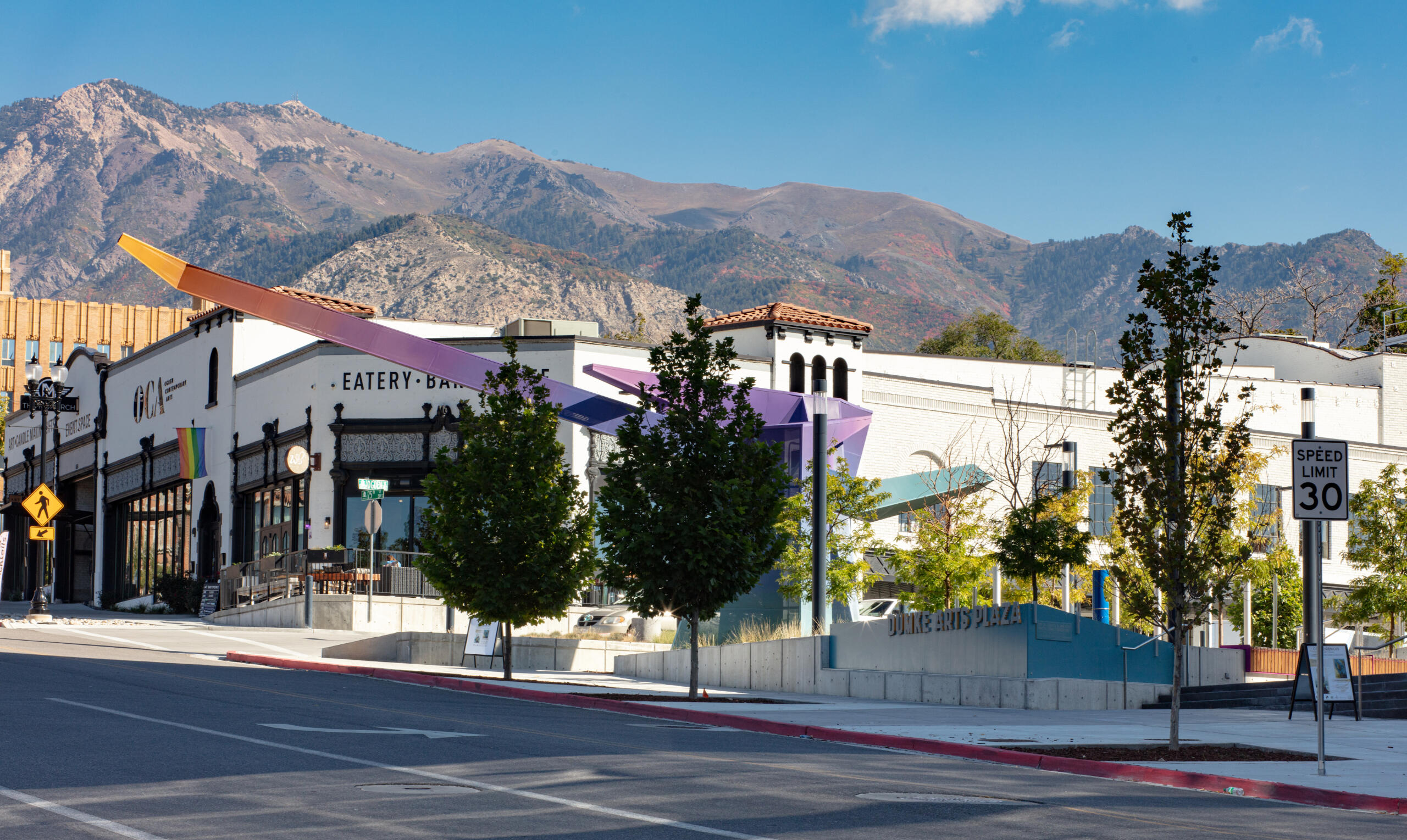
Signage, landscape, and sculpture.
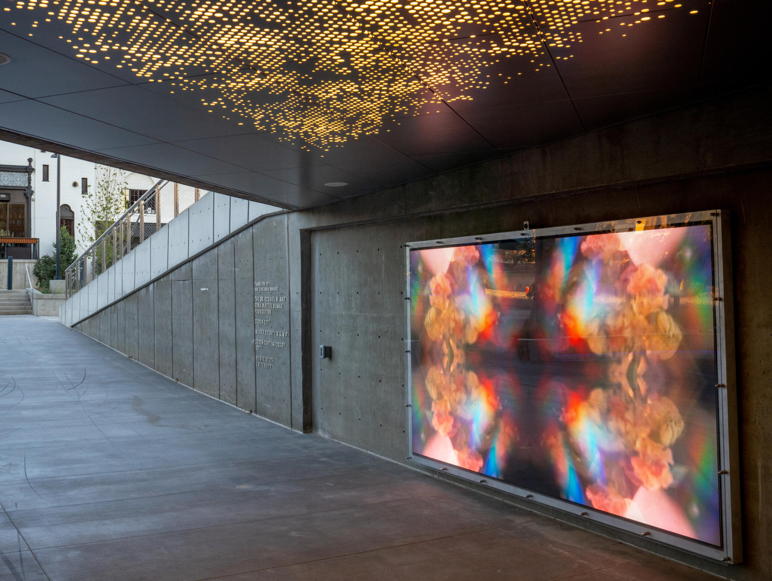
Donor signage was included in this large based community project.
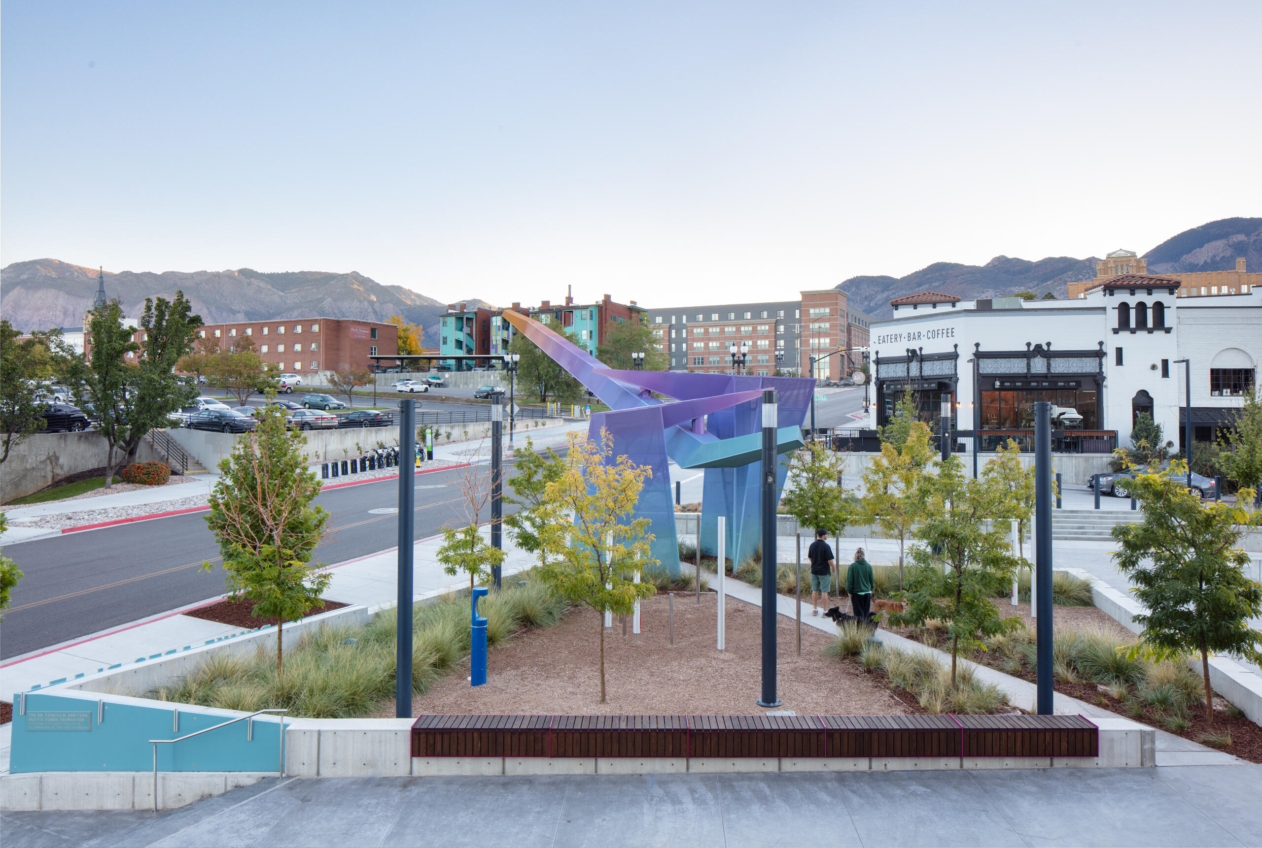
Landscape, signage and sculpture playing off the natural colors of the landscape.
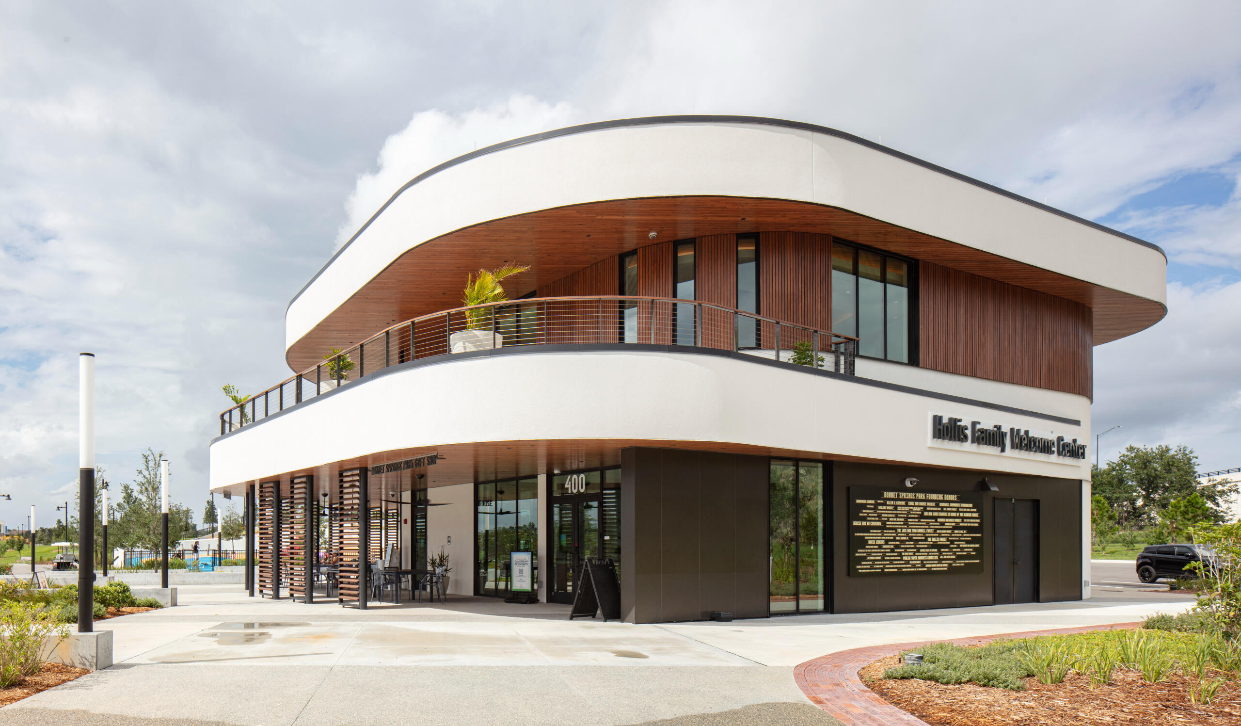
Bonnet Springs Park
This once abandoned rail yard was transformed into a cross-functional space for the local community. Located in Lakeland Florida, this 168 acre project houses parks, paths, a children's museum, welcome center, event center, boat house, and playgrounds.The signage design worked alongside the landscape and architecture teams to create a signage family that paid homage to the history of the site. The exterior signage is playful and vibrant. The interior signage plays off the design principles of the exterior signage, but adapts to the interior design of each of the spaces. There was an extensive donor program that resulted in custom signage designs and applications.Client: Bonney Springs Park Inc.
Designers: Sasaki
Project Completed: 2022
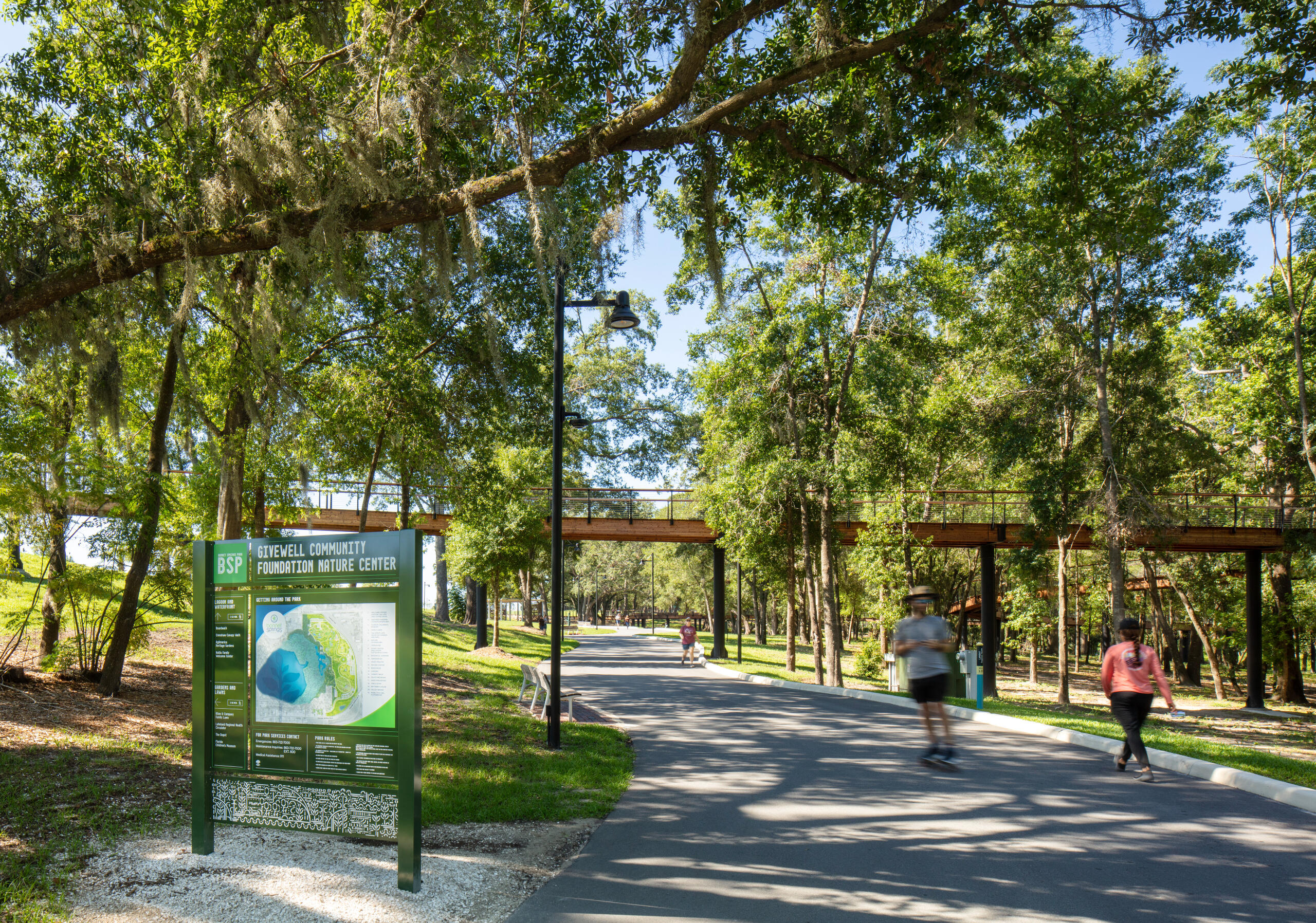
Site signage throughout the park is a bespoke design based on the previous rail yard that used to occupy the site. The font and linear graphics subtly give a nod to trains and rails, while allowing the signage to feel integrated and incorporated with its surroundings.
The custom designed signage extended from park wayfinding to building identification, down to an extensive donor program. This image shows a donor wall, as well as overhead blade donor signage. The scale of giving to the park was reflected in the type of donor signage allotted.
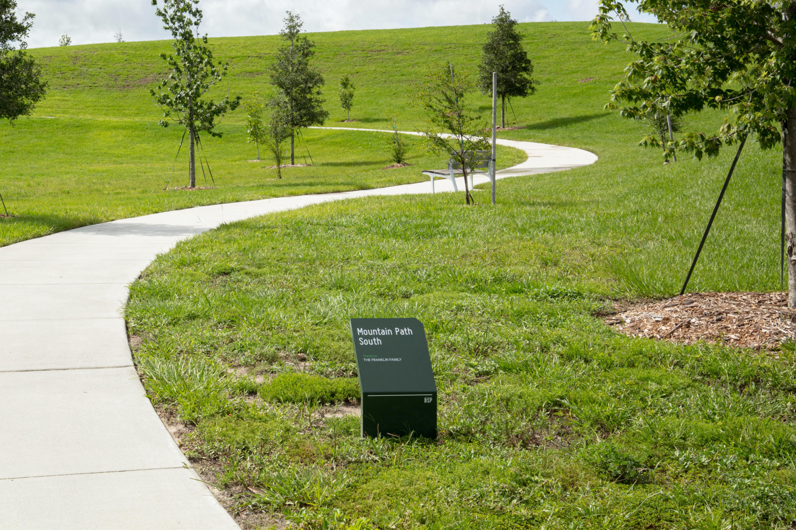
Each unique pathway within the park was given a name for circulation clarity, as well as includes a name of a donor.
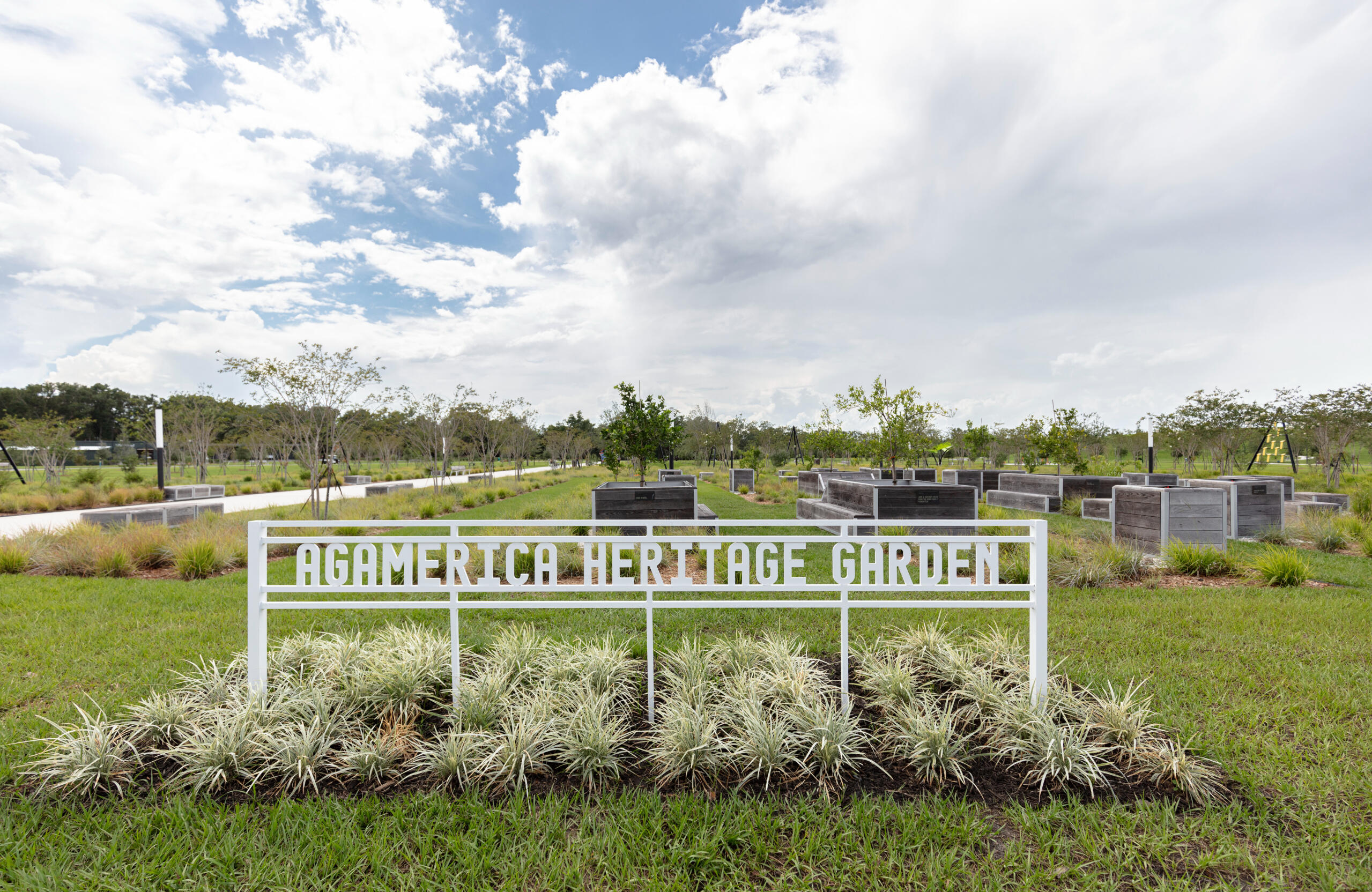
Large donors were provided bespoke donor monuments to commemorate areas of the park.
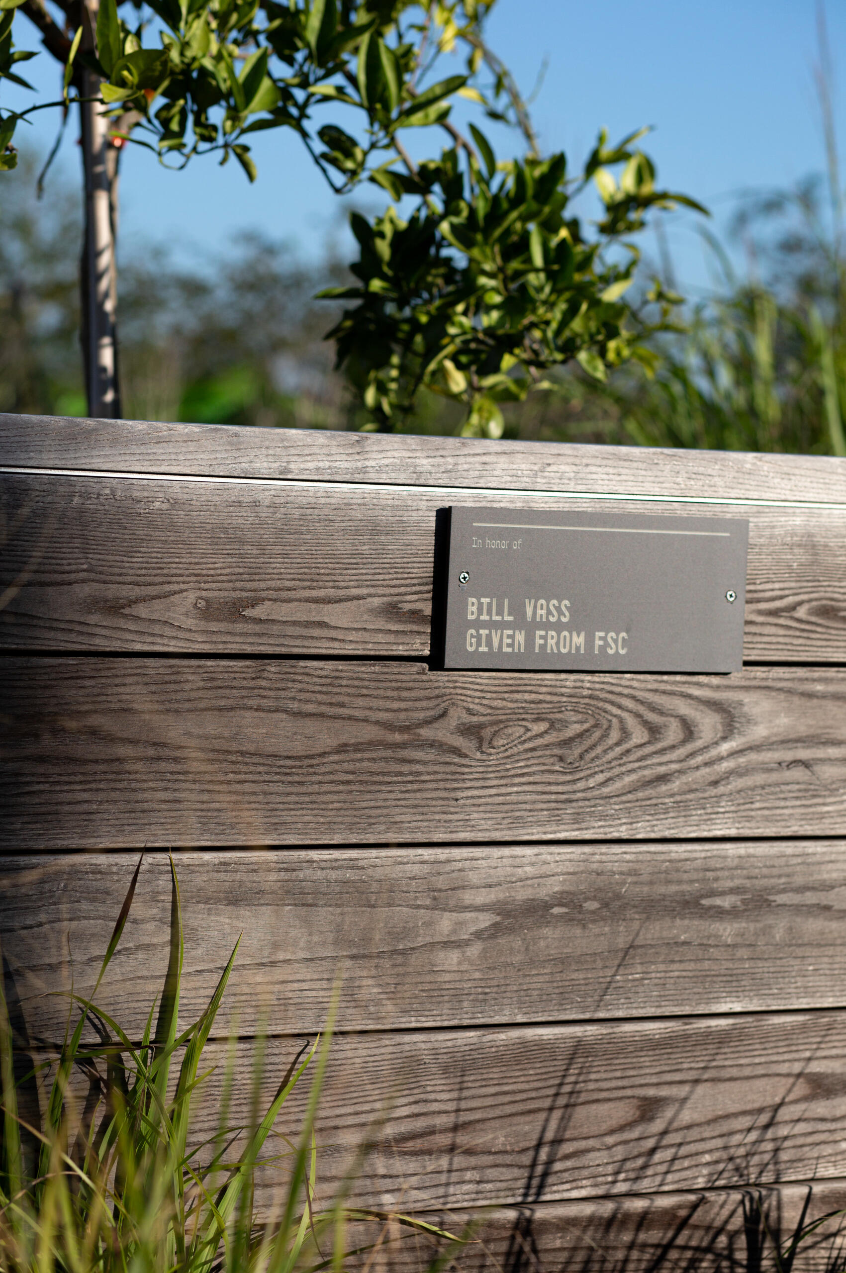
Donor signage extended down to individual planter boxes. Plaques were designed using the custom font developed for this project.
Wilmington Waterfront Promenade
Home to an old industrial port, this site was transformed into a community gathering space. With waterfront views, this promenade gives water access to all its surrounding patrons.Wanting to distinguish this site as a welcoming place, building a clear identity for the site was very important. Once on the site, the wayfinding program give a clear understanding of the site's amenities.Client: Port of Los Angeles
Designers: Sasaki
Project Completed: 2024
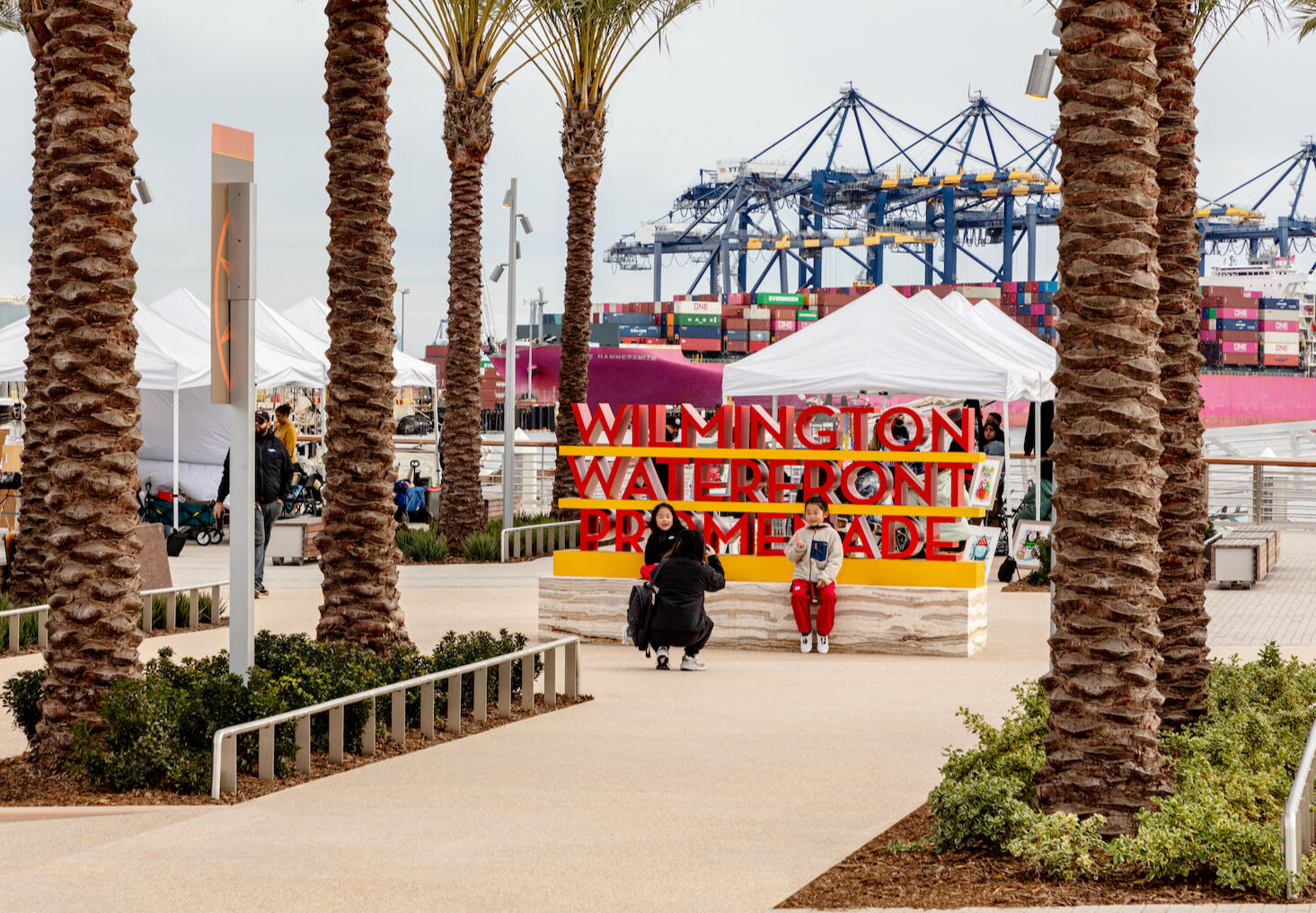
The site identity signage was developed as a prime focal point along the primary promenade. Utilizing the brand colors, the signage was meant to act as a landmark, a photo opportunity, and a place to rest.
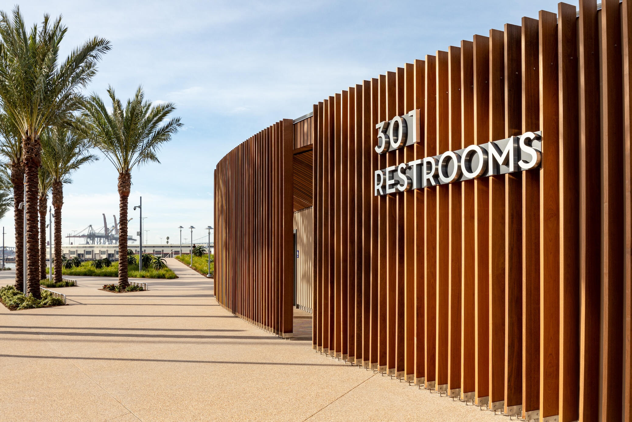
Address identification and program signage.
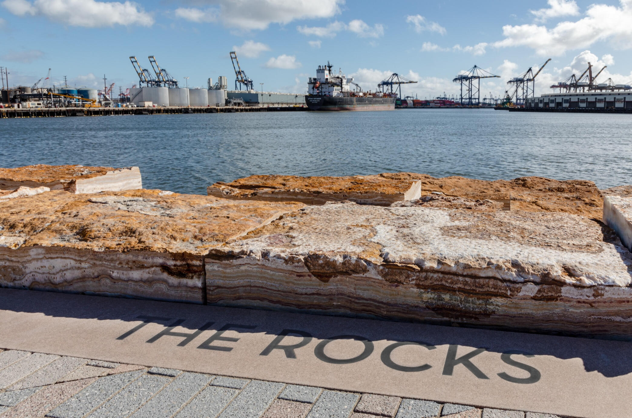
Engraved program signage in the pavers of the promenade.
SharkNinja HQ Expansion
This corporate interior was an expansion on an existing space for the client. wanting to make the new and old spaces feel connected, there were thoughtful graphic and architectural gestures that allowed the new and old space to flow together.Wanting to embed the feeling of "the five star experience" the graphics leaned into the theme of technology and the cosmos. The graphics stretched across long white expanses to give visual interest and connect the interior spaces. Company values became feature walls that elevate open spaces.Client: SharkNinja
Designers: Sasaki
Project Completed: 2023

This first hint of the design theme appears in a shared lobby space. The office is identified with a dimensional logo backed with a custom graphic. The linear ribbon is the merged idea of technology and celestial nods.

Company values have the biggest and boldest gestures of the theme. The merge all the graphic styles and brand colors as a textural background to support the mission text.

The technology ribbon extends down long white expanses to connect values graphics with circulation spaces. The ribbon wrap the corning and transitions color where wall color changes.

Values graphic.
Print and Branding
As part of my graphic design services, I have created, evolved, and iterated brands into many medium facets. Developing a look and identity for a company, institution, and product is just as important as its application. These applications include brand identity, internal communications collateral, award submission infographics, and page layout and template design. Below are some samples of brand development and application I have implemented.
Print Work
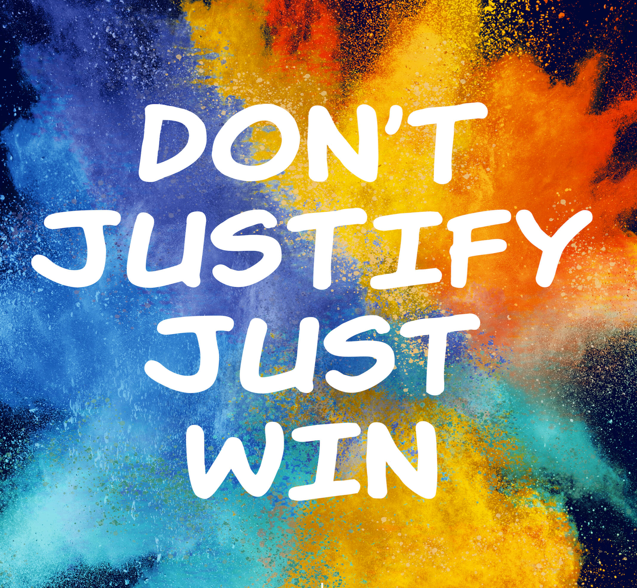
Motivation poster developed for internal use at global corporate locations.
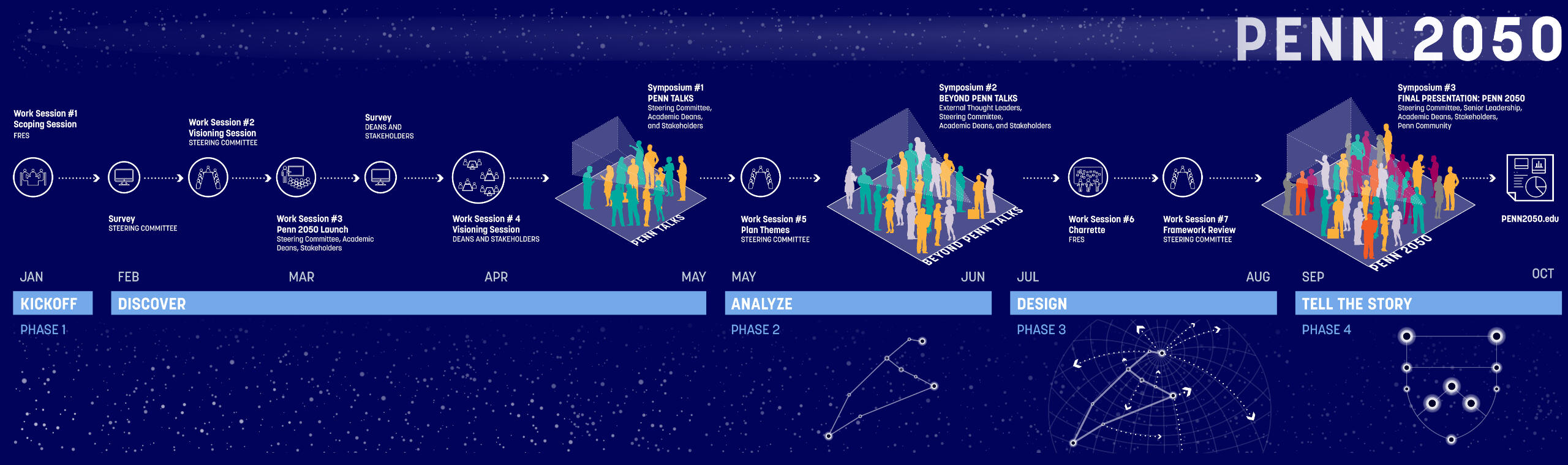
Infographic for a project schedule integrating the themes from the project as well as school branding.
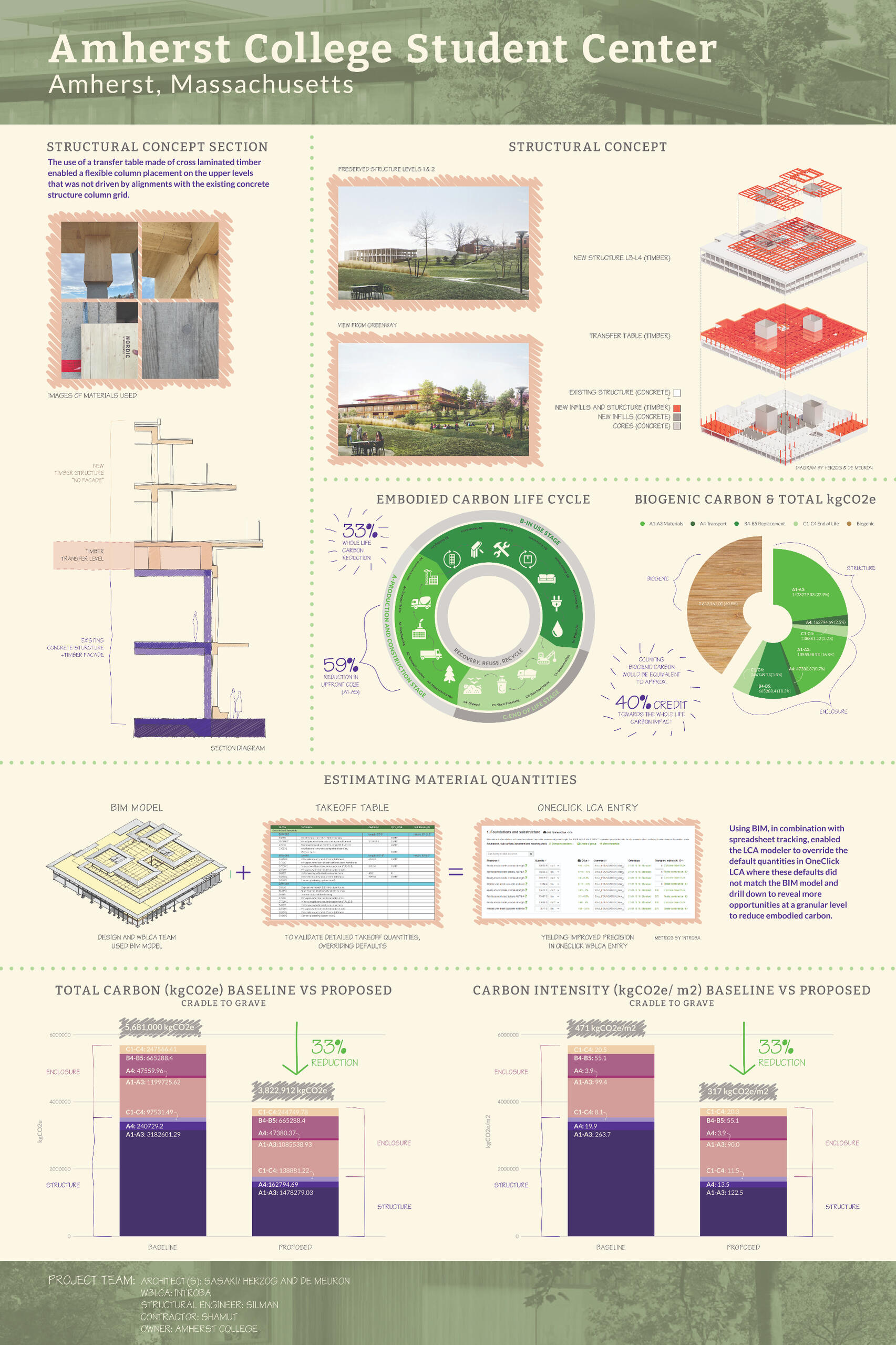
Infographic poster created for embedded carbon competition.
Brand Development
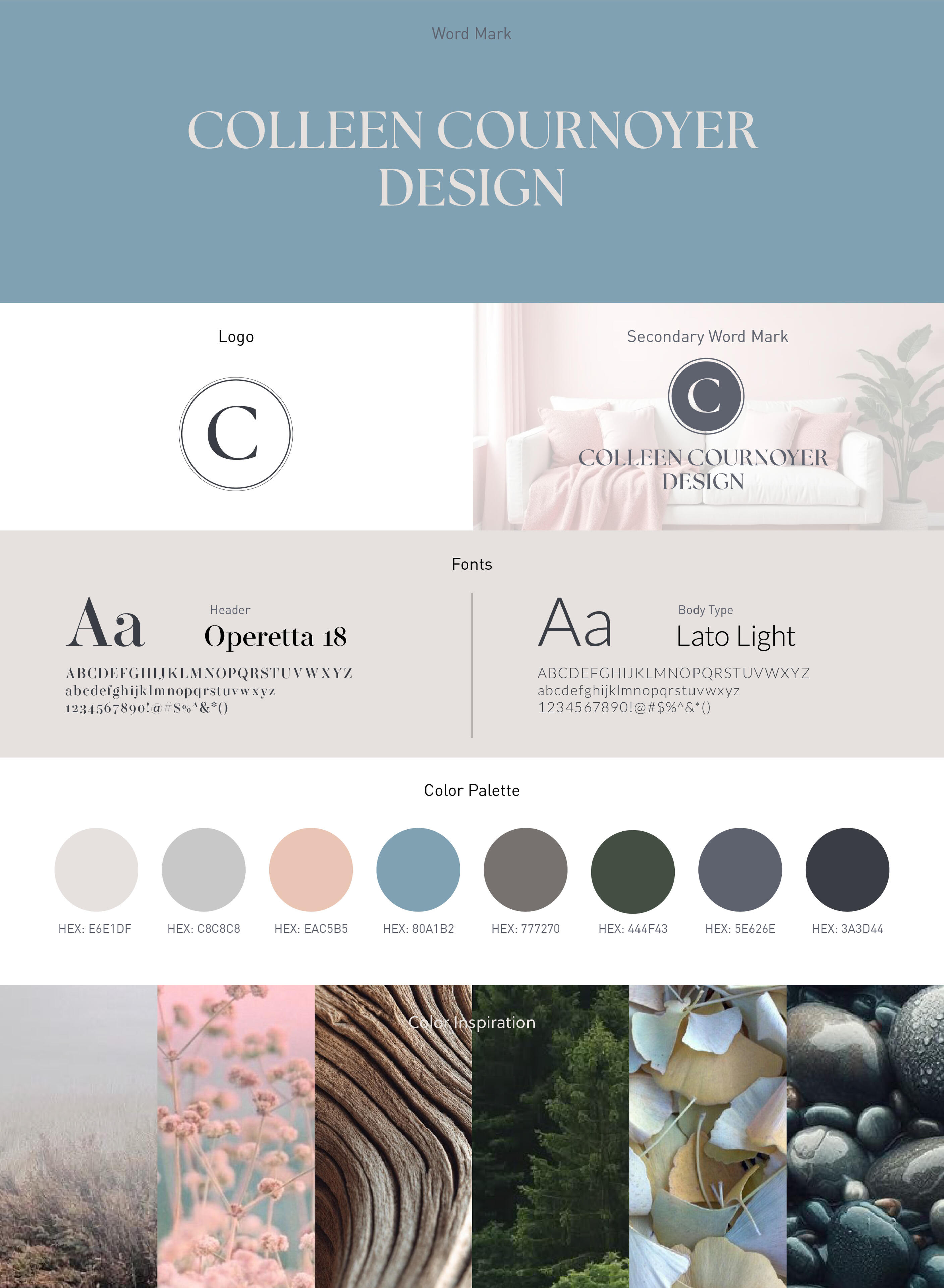
Brand identity design for a business. Assets developed for website, print, and formal letterhead.
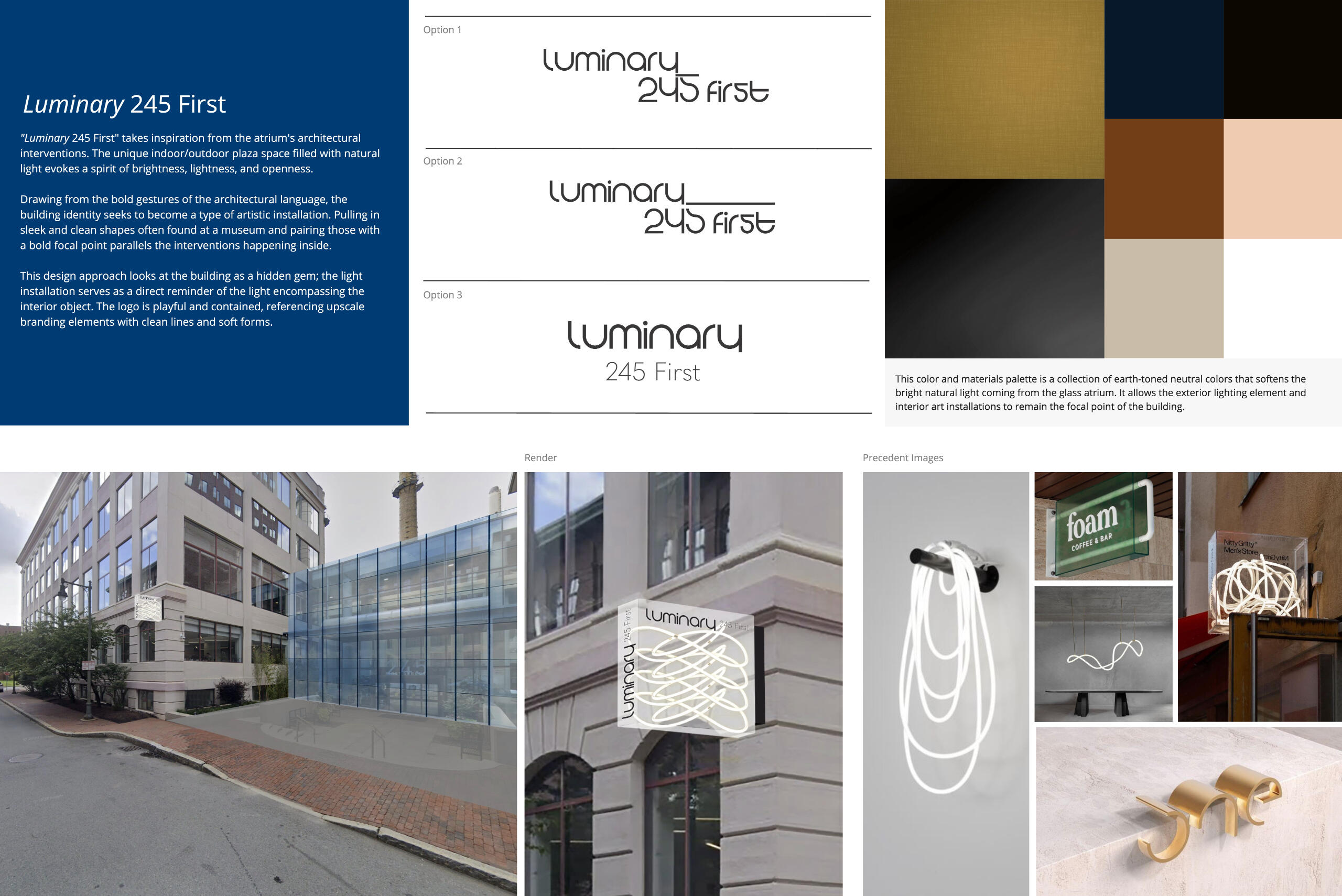
Brand identity development for project pursuit.
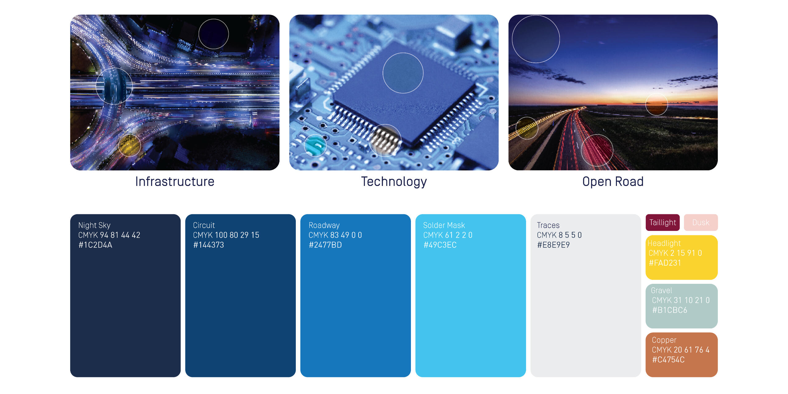
Brand development for a car focused company that expanded upon an existing standard. This effort was to grow the color pallete to allow for a deeper range of colors for office interior modifications.
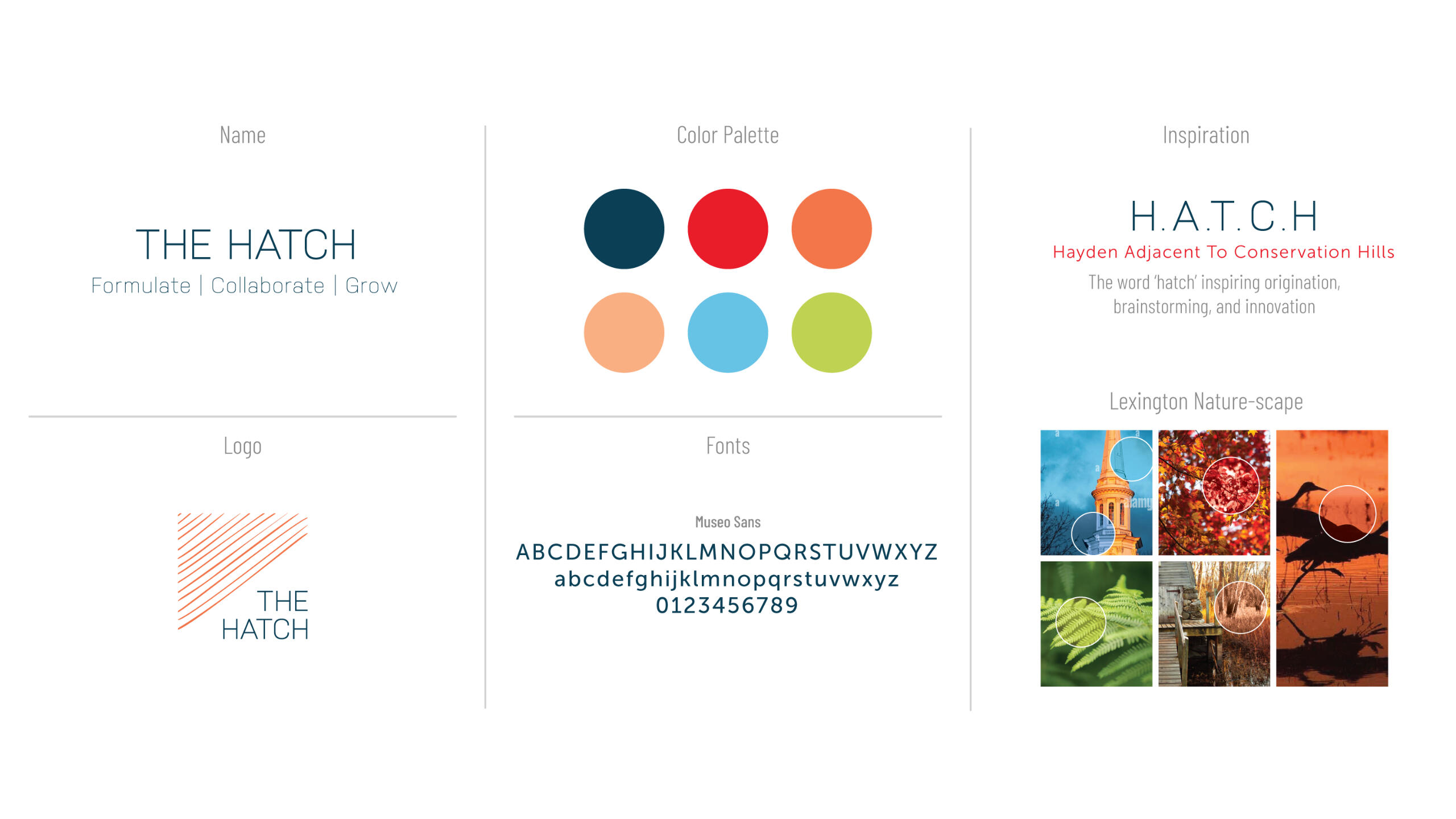
Brand identity visioning session that plays with the change in building identification through a rebrand. This shows one of many options for a logo and style refresh.
Presentation and Template Design
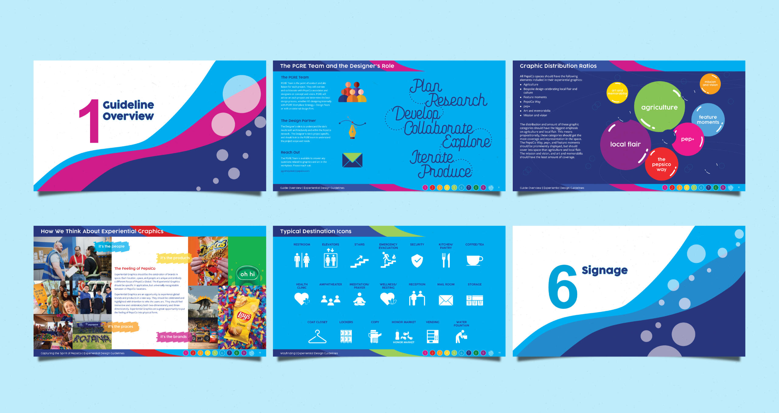
Internal guideline document that was developed to serve as a reference for all future vendors, designers, and contractors. The guideline was developed in the companies voice and serves to embody their mission and vision for their office spaces.
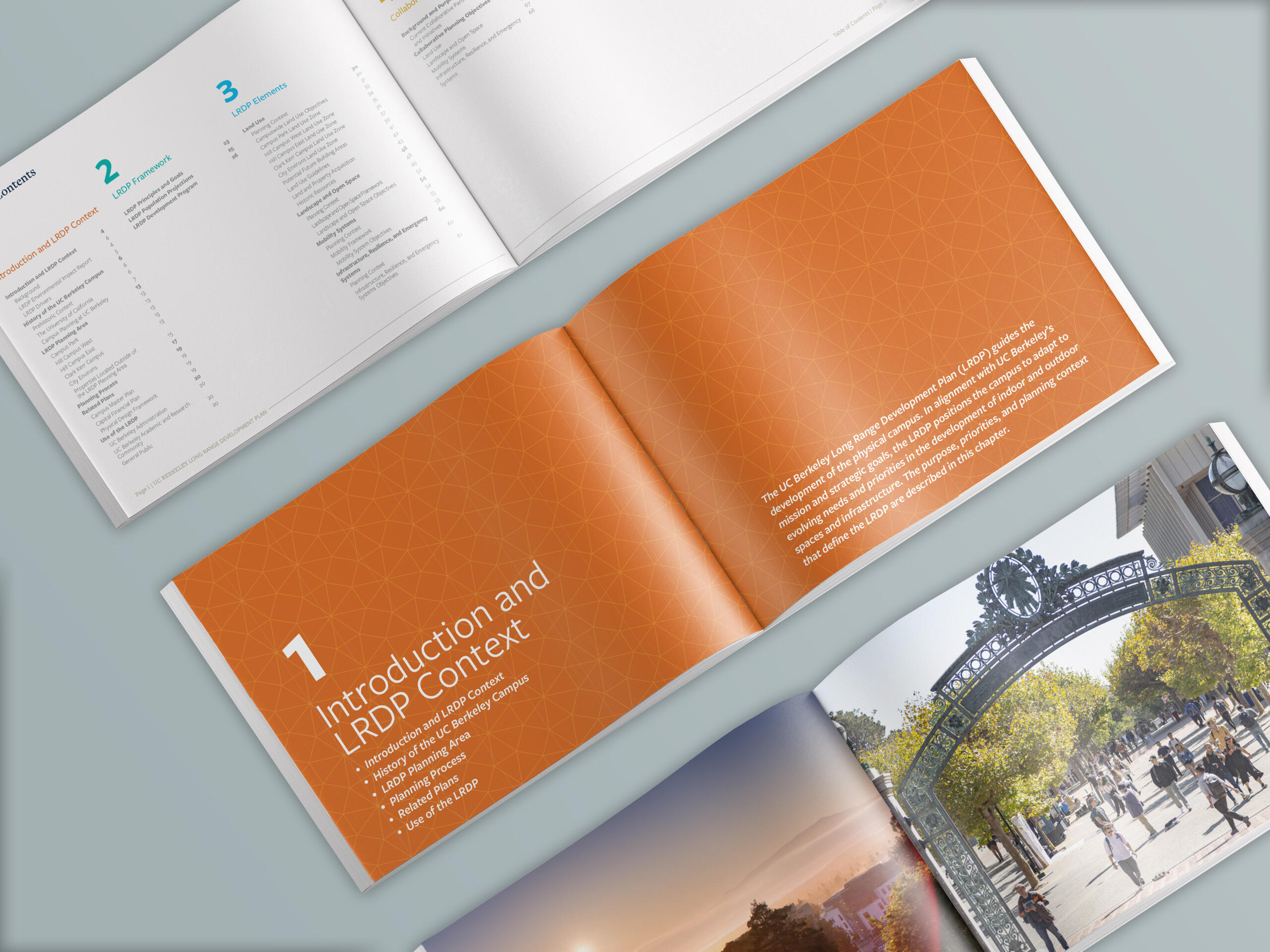
Report template created for a Master Plan. Chapter divider graphics, typography, layout, and divider images all relate back to the institution's brand and visual guidelines, that were adapted to tell the Master Plan story.
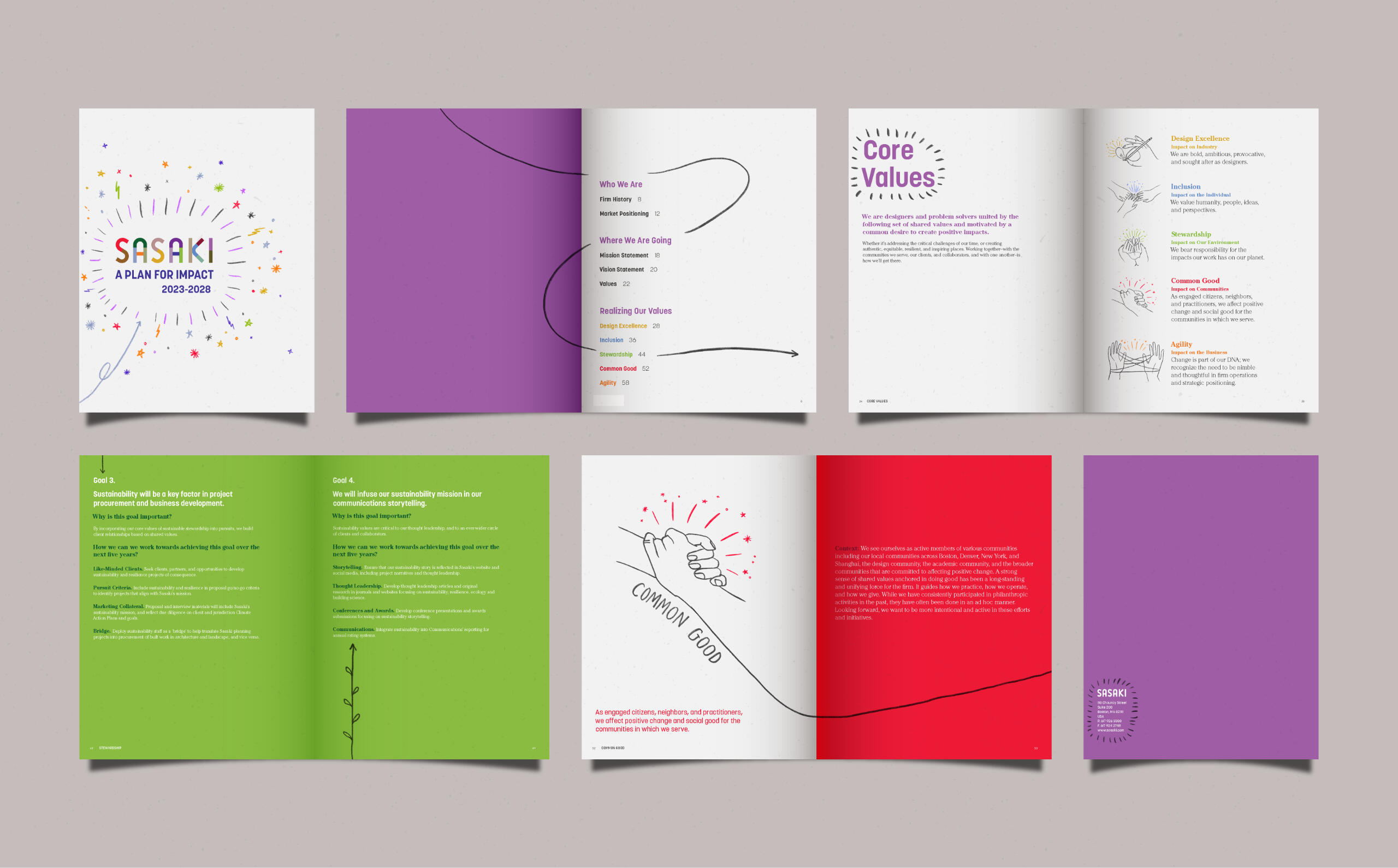
Strategic plan book developed as a reference guide for the future years. The colors, imagery, and layout align with the company's internal branding and visual style.
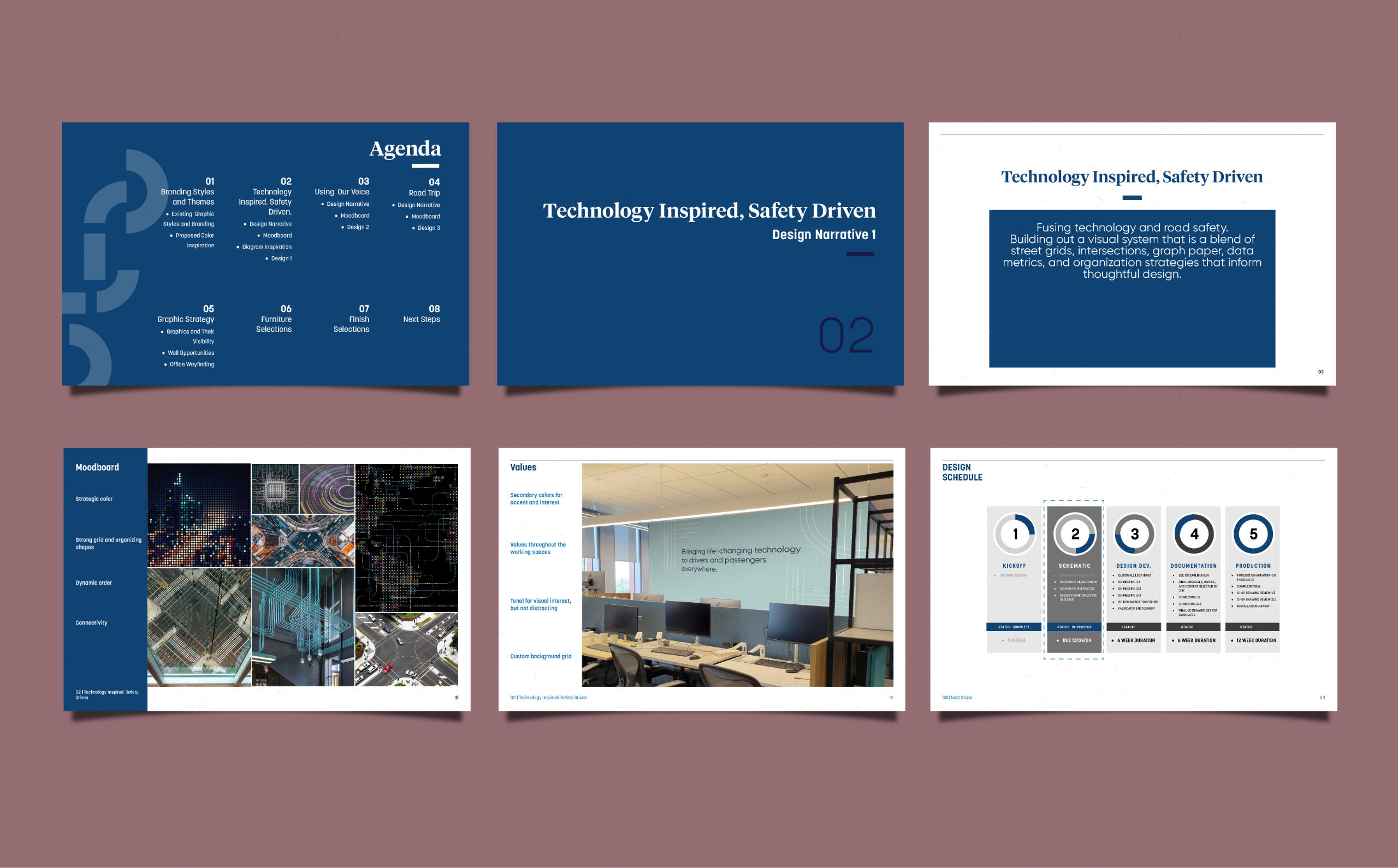
PowerPoint presentation spreads. The template was designed for eye catching cover pages and section dividers to align with existing branding. The body pages align with the branding and contain a bold footer.
Design presentation spread. Chapter breaks, head/footer, and document fonts align with client branding. The deck is designed to be minimal in text to let the imagery be the hero.
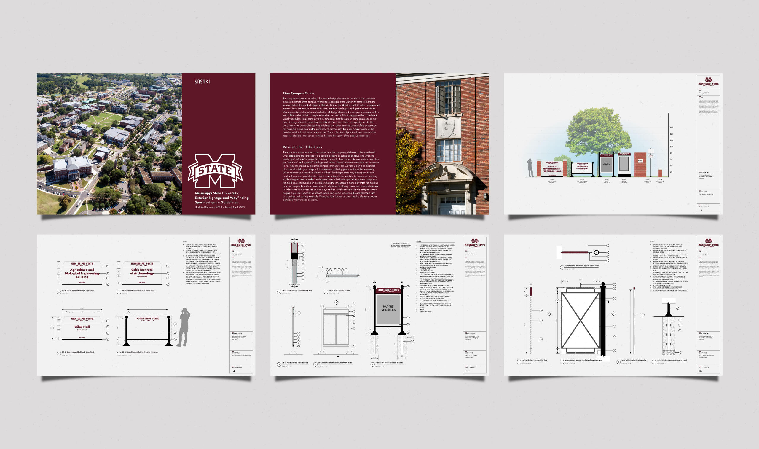
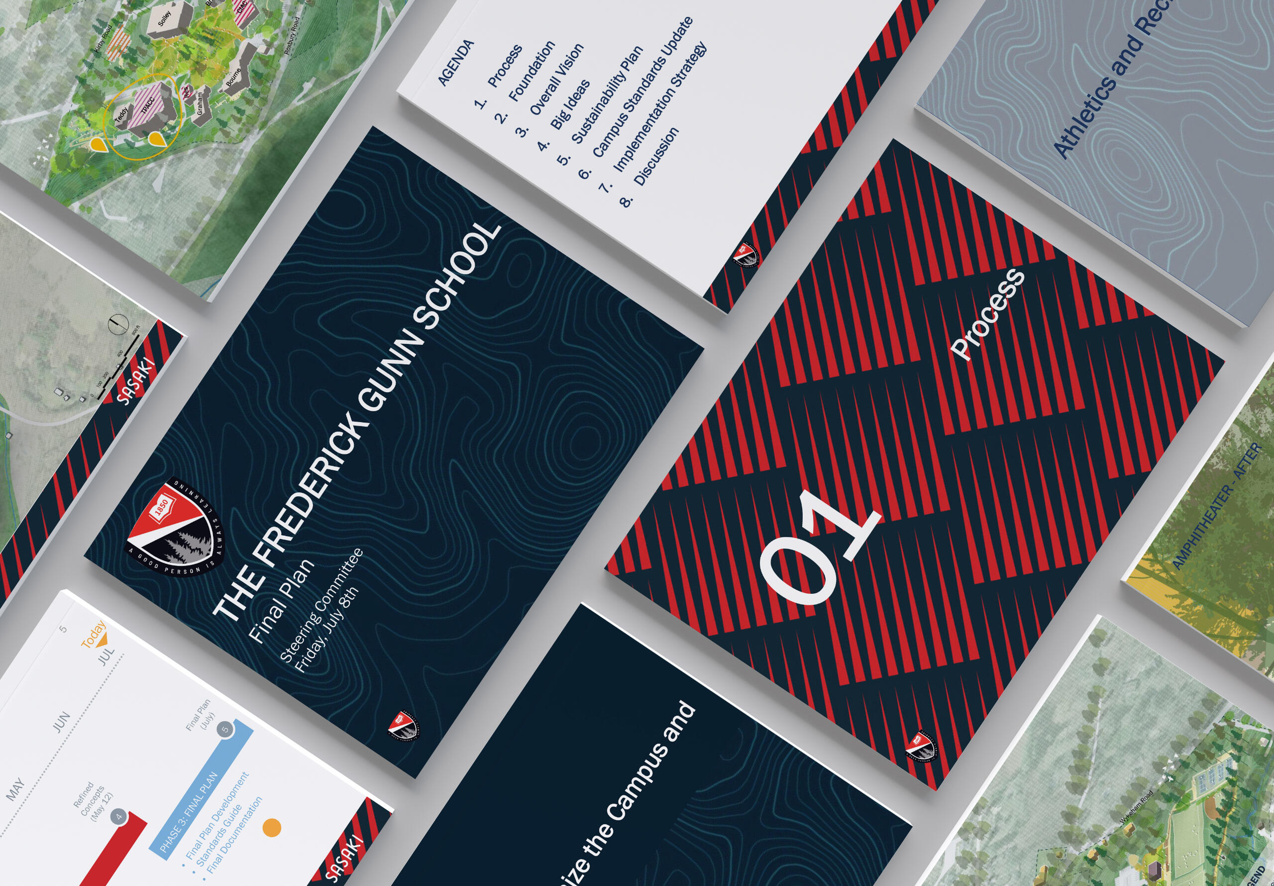
Signage Standard documentation is a compiled book that shows the style and construction intention of campus signage. The document booklet and signage was designed alongside the university to serve as a template for signage standards across campus.
Merch Branding
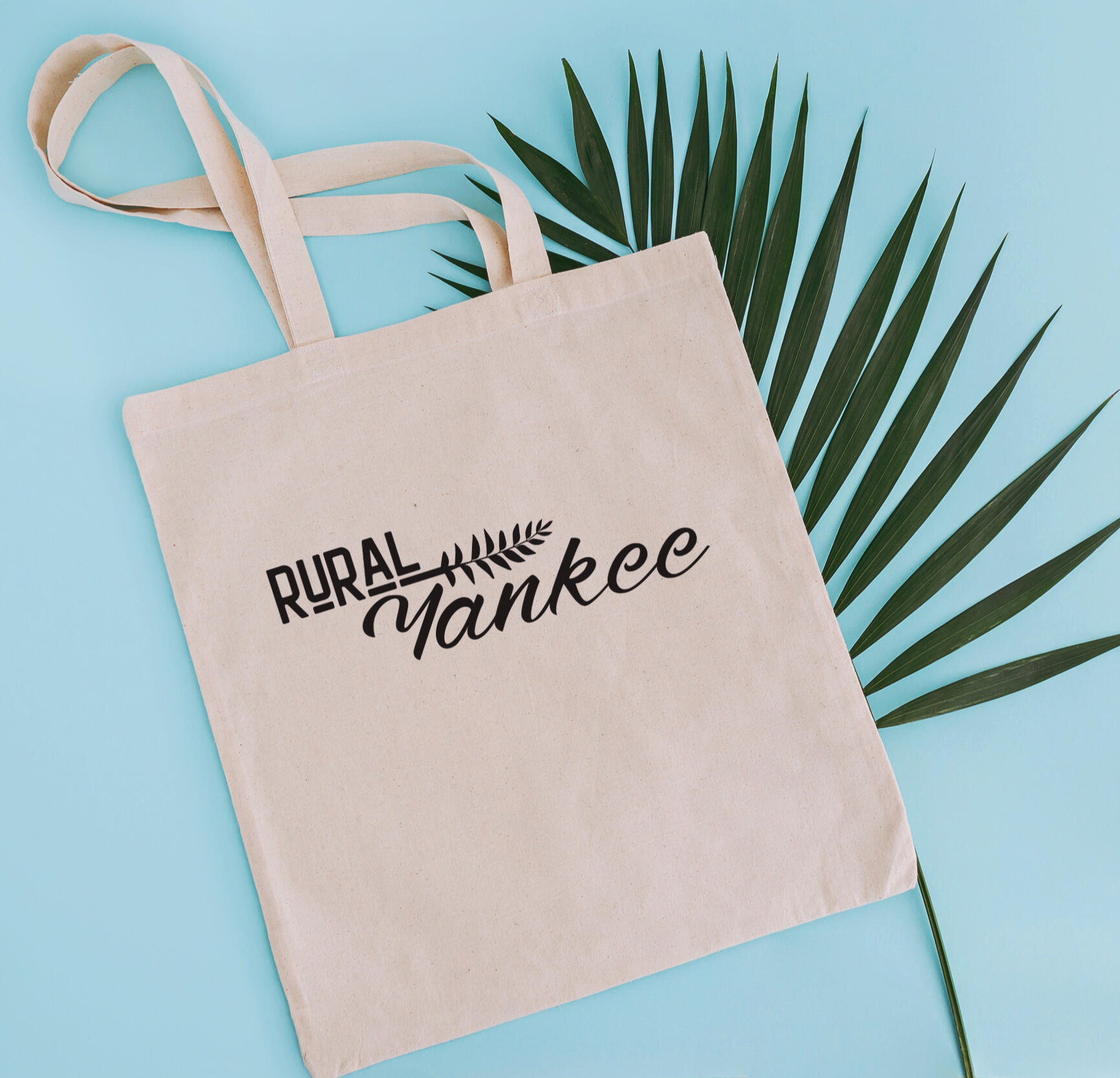
Custom logo "Rural Yankee" developed for an event take-away item.
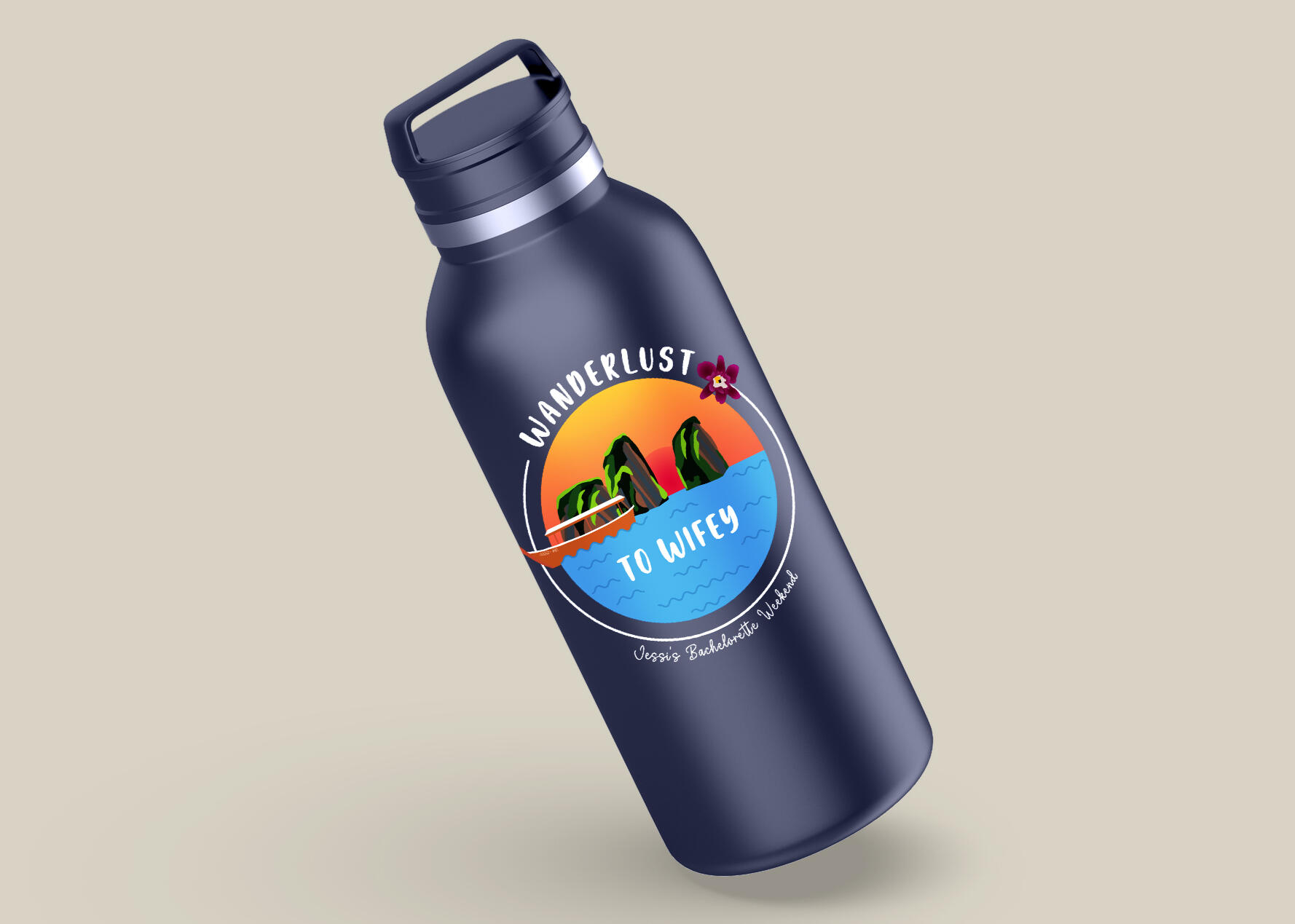
Custom logo "Wanderlust" and pictogram developed for an event take-away item.
About Caitlin
I'm a graphic design professional with over ten years of experience in the field. I have been a Graphic Design Lead since 2021 at Sasaki. I started my professional career as a set designer for theater, transitioned to signage fabrication, and inevitably landed back in the design world as a graphic designer. My expertise is in Experiential Graphic design, which expands upon brands and client narratives and transforms them into actualized designs in space. Understanding how ideas can transform from paper into 3d or printed forms make any idea come to life. I thrive in this kind of design.I have extensive brand knowledge in how to develop, iterate and reinterpret brand identities. I have exceptional knowledge of typography and how to use it. I also love a design challenge.If you'd like to learn more about me and my work experience, please don't hesitate to reach out.Email:
[email protected]